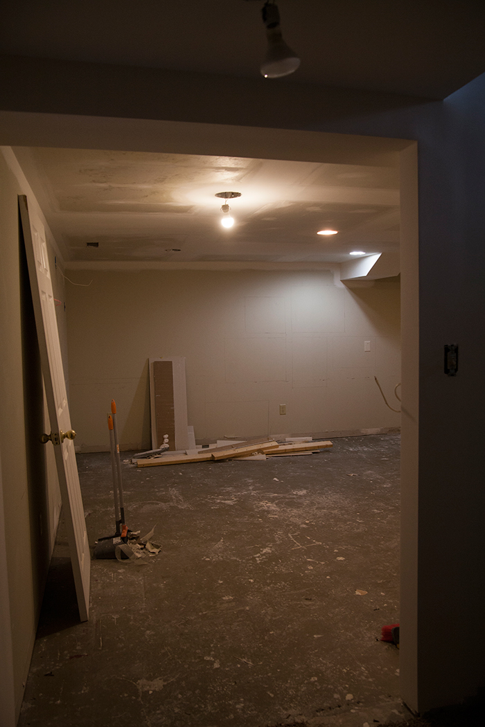
It’s already Wednesday??? Oh my, the time is flying by and we’re nearing the halfway mark. I’m panicking a bit, but Micah is as cool as a cucumber he builds a McDonald’s from the ground up in 60 days…this is nothing! Last time I left you Micah had put up the drywall and roughed in for the electrical. Over the past week we’ve had our drywall guy here taping, mudding, and sanding, and I’m happy to say that big mess is over.
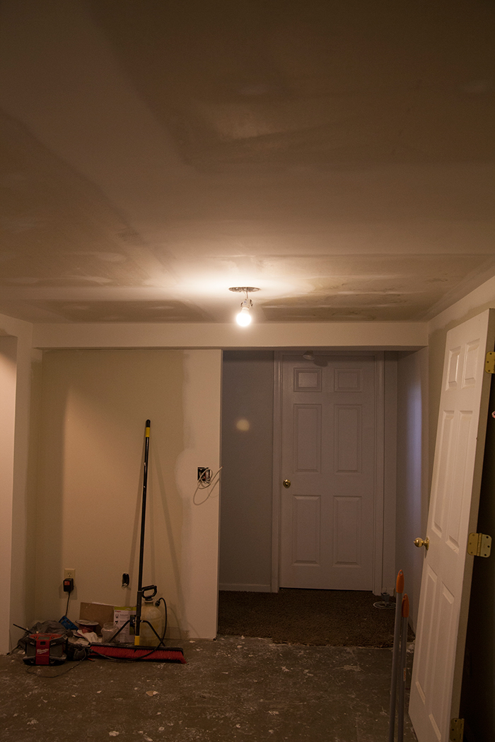
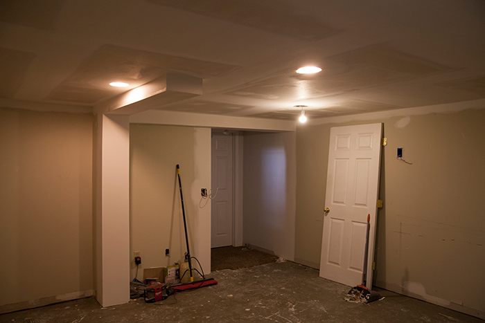
I’m still super happy with our decision to open up the doorway and you can even get a bit of natural light from the upstairs through it. We had plans to put up the moulding over the weekend, but things didn’t get done as quickly as we’d hoped so we spent our time focusing on finishing up the kitchen. We’re getting so close in there, and it feels great to have the main level looking a bit more normal other than the library filled to the brim with basement things.
Today I wanted to discuss lighting. It’s a topic people often overlook, but layering light types and levels has the power to transform a space, specifically a windowless one. To begin with, this basement had a basic fan/globe light smack in the center of the 7′ ceilings and that was it. Not only was it not enough light talk about enhancing the dark, dingy corners the hanging fixture made the ceilings feel even shorter. So we got rid of it, and Micah put in five can lights. Cans aren’t beautiful, but these lights are discrete and having something that’s flush with the ceiling just opens up the space so much. This kind of lighting is called ambient lighting because it provides the overall illumination and gives off a comfortable glow. Always put ambient lighting on a dimmer if you can!
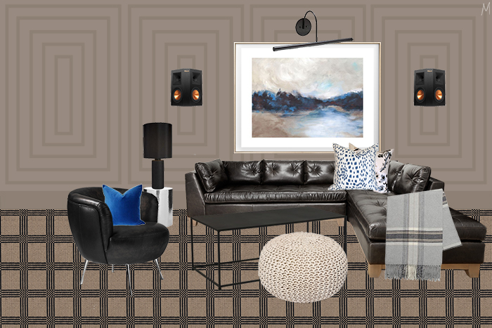
Lamps are known as task lighting. Where one is good, more is better. I plan to have at least two different lamps in here, but luckily they’re an easy addition at any point if more lighting is needed.
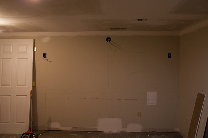
Most people focus on the ceiling light and maybe a lamp or two, but I’ve learned that you’re definitely missing the mark if you don’t take a moment to explore other options, specifically accent lighting. The thing with hardwired lighting that can be tricky is the fact that it has to be one of the first things you figure out. Adding sconces isn’t as simple as wiring something up after you’ve got the buffet in place. If they’re a new addition you have to rough in and usually do some drywall repair before you add any wall treatments or paint. You need to know specifications before you rough in so you can get your spacing correct. This is why I like to create boards to get an idea of how things will come together…I’m a visual decision-maker. When you know you’re painting it’s a great opportunity to draw things out on the wall. I drew out the sectional to figure out where the picture light would fit above.
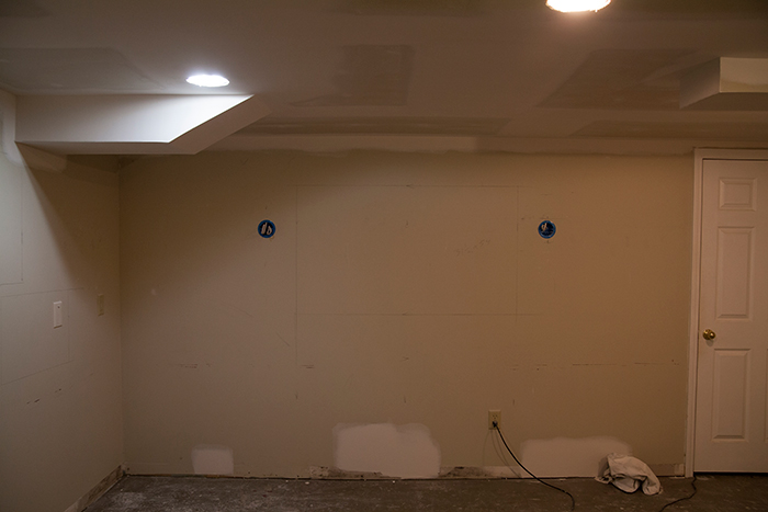
And we planned out the TV to place the sconces.
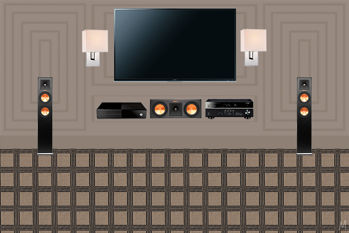
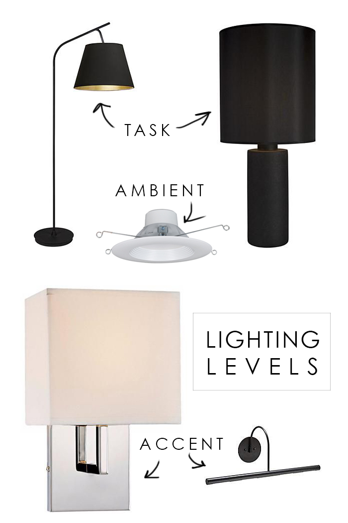
FLOOR LAMP | TABLE LAMP | CAN LIGHT | SCONCE | PICTURE LIGHT
I’d love to hear your lighting tips and tricks! What did I miss?
Need to catch up?
Be sure to check out the other participants updates, and thank you again to Linda for including me!


You move fast – I can’t wait to see the final product. It’s fun to watch the progress. I love that you focus on lighting layers. So many “design” bloggers have no clue about what is involved in real design. I can always tell a rookie when they don’t have many light sources in a room. Ambient lighting is key, too. My kids actually know that when I walk in a room, they better have the lighting in “ambient” mode or I’ll shout out “Ambient lighting please!” One thought, though – having sconces so close to the TV means the light might bounce off the screen. It looks good from a design perspective, but you end up never turning on those lights except for bright light TV watching (sports, etc.). For movies, it tends to be a buzz kill when you can’t see the picture because of the light. That being said, it looks like your shades cover the bulb completely from the side. I guess you might have your lighting shop add a frosted glass/plastic to the top and bottom of the shade if it becomes a problem (that’s how I solved it.)
Again – kudos on such wonderful work. I discovered your blog via the One Room Challenge and have placed you on my Bloglovin’ reading list. I don’t want to miss the inspiration.
I’m certainly still learning, but lighting is something I used to be a bit overwhelmed by but knew it was important. The sconces by the TV was definitely a concern, but I love the look and that’s why I went with the shades. They will also be on a dimmer to keep the level low for TV watching. Thanks for following along, Trish!
My sister in law did similar to sconce near TV – our experience is you will need to turn them off for viewing comfort even with a shade and dimmer. Perhaps a good excuse to add another lamp? Love your blog, can’t wait to see this space finished
Wow, you have come a long way this week. Lighting does make a lot of difference in a space. We have 2 of those kinds of ambient lighting in our family room and they do not provide enough light. So for now, floor lamps and opened doors are what is giving us the most lights (until we figure out what to do). Thank you for the tips. I know your room is going to be fabulous!
Lamps are always a great option, especially if you can get the light at different levels. Thanks for reading, Zan and have a great rest of the week!
Hey, hey . . . great name, Zan!
Totally on point with your lighting pro’s. I just had a client who I suggested sconces over a little reading nook to and she couldn’t understand why she needed to add anymore light. Think I’ll send her this post :). Looking good in the basement room- keep on trucking!
Ha, thanks Erin! We definitely will!
What a great post! I learned a ton about lighting I hadn’t even thought about. I am loving your plans for this space and I can’t wait to see how it turns out!
You are so right about sconces. Hard to add later on, but challenging to place before-hand. I usually just hold my breath and hope for the best! 😉
You’ve really covered it with lighting. My only other trick is a mirror or two to reflect more light!
You’re so right about the mirror! Sneaking one of those in too. 😉
I can’t wait to see this space. Your lighting choices are so good. Rarely does Florida have basements, but we certainly have rooms with no light so I can appreciate how you addressed the lighting.
Your entire house is just amazing! You and your husband make a fantastic team!!!
Lots of progress! Can’t wait to see all of your lighting picks in the space.
Cheers! xo the Waiting on Martha team
The larger doorway really makes a huge improvement. Like you, I like to have a visual when designing a space – blue painter’s tape is my friend! Wall art also helps a ton. My hubby cannot visual a space before it is done but I can and that can create friction. So the painter’s tape and wall art also helps with that. But his geometry skills rock and mine don’t -very handy when installing roof rafters.
We did sconces next to our bed and I drove my husband crazy measuring and re-measuring. But they ended up in the right spot so who cares if we measured liked 300 times!!! Love the kitchen reno – was not sure about the floor at first but now that you are almost done, I love it! Hubby was drooling over your new fridge!
Tape is a great option too! Glad I’m not the only one driving my husband crazy… 😉
Love the lighting plan. I am dying over the trim you have planned. I feel your exhaustion. Hang in there.
We’ve got this! 😉
I love seeing all of your layers of light! You will be so glad you have them all…each one is spectacular, it will be amazing to see them all together in the finished space!
Thanks, Kristin, I’m excited to see how they work together!