*This project is sponsored by Lowe’s, but all thoughts, opinions, and selections are my own.
We’re coming out of the rough-in part of the laundry room, and it seems like the perfect time to talk about the more exciting end of this renovation: the design! I’ve been thinking about how to best design this room for almost five years now, and it’s been designed since last year. To say that every little detail has been obsessed over may be an understatement. So let’s dive into some of those details, shall we?
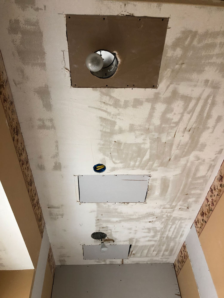
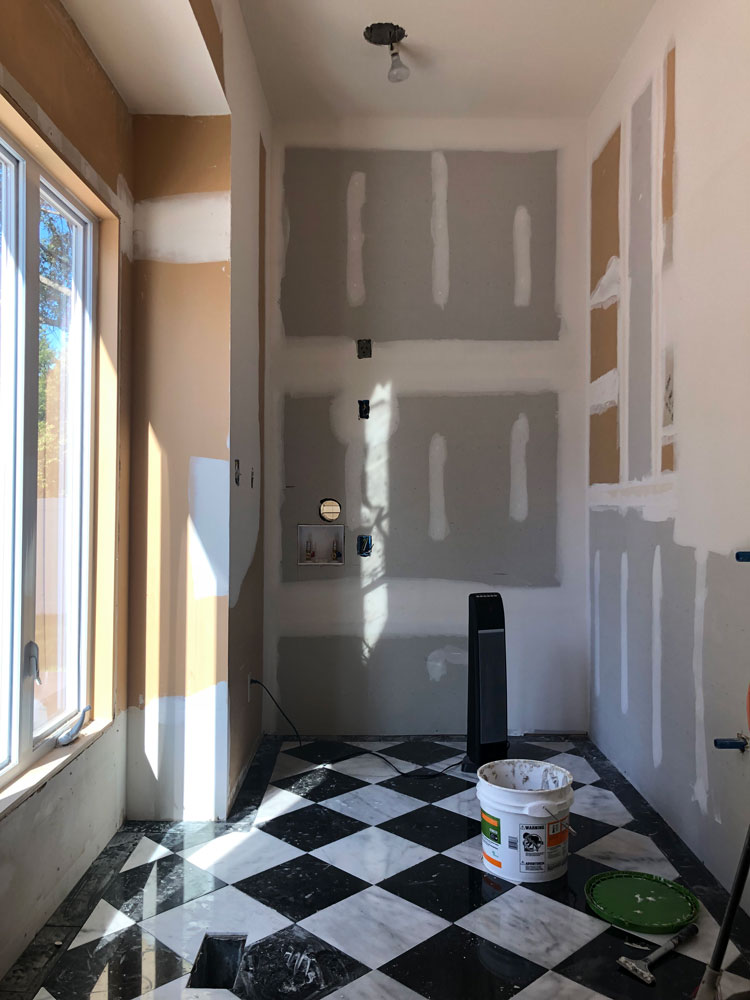
We still have a lot of work to do, but the work moving forward is the more fulfilling, pretty part. The work behind us the moving and adding of plumbing and electrical, the backer board, the drywall is crucial but never as satisfying to me. Deciding where plumbing and electrical need to go before fixtures are in place is a tricky and tedious thing that involves lots of measuring. We had to move all of the lights because once we add floor to ceiling cabinets, the original spots would no longer be centered. Because of new cabinet placement we also had to move switches and outlets. Figuring out where the faucet has to go before there is anything on the wall is another anxiety-inducing task, and one that I trust my contractor husband and plumber brother-in-law to get right over myself.
Starting from the ground up, the plan was always to continue the kitchen floor into here. I think anytime you can keep flooring the same it just helps spaces flow. And when your rooms have lots of personality, floors can bring some needed continuity. These tiles are black granite and white marble from Lowe’s. They are in stock and very affordable. Laying them in a diamond pattern and adding the border amps up the look, although you won’t see much of the border once the cabinets are in. I appreciate that Micah still added the border in here anyway – he knows his perfectionist wife well. He spaced the tiles with 1/16″ spacers and used black grout.
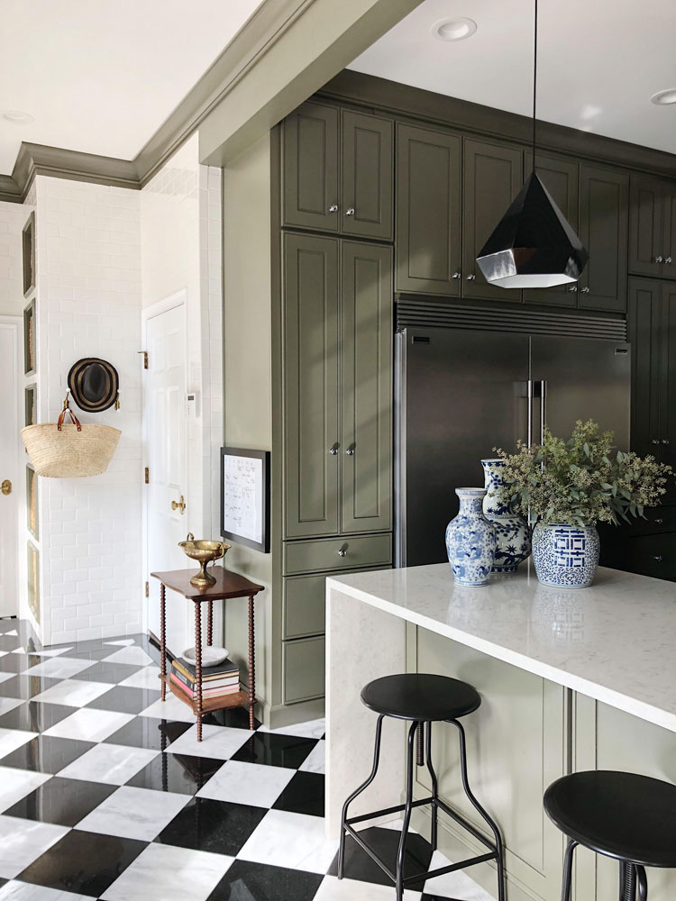
Another way to bring continuity is in cabinet style. We’ll be using the same Kraftmaid cabinet profile as our kitchen but in a different color. We put in the kitchen cabinets almost four years ago, and I still love them. They have held up beautifully and functioned wonderfully. I’ll do a separate post about the cabinets, but they really were the jumping off point for the other choices in the laundry room.
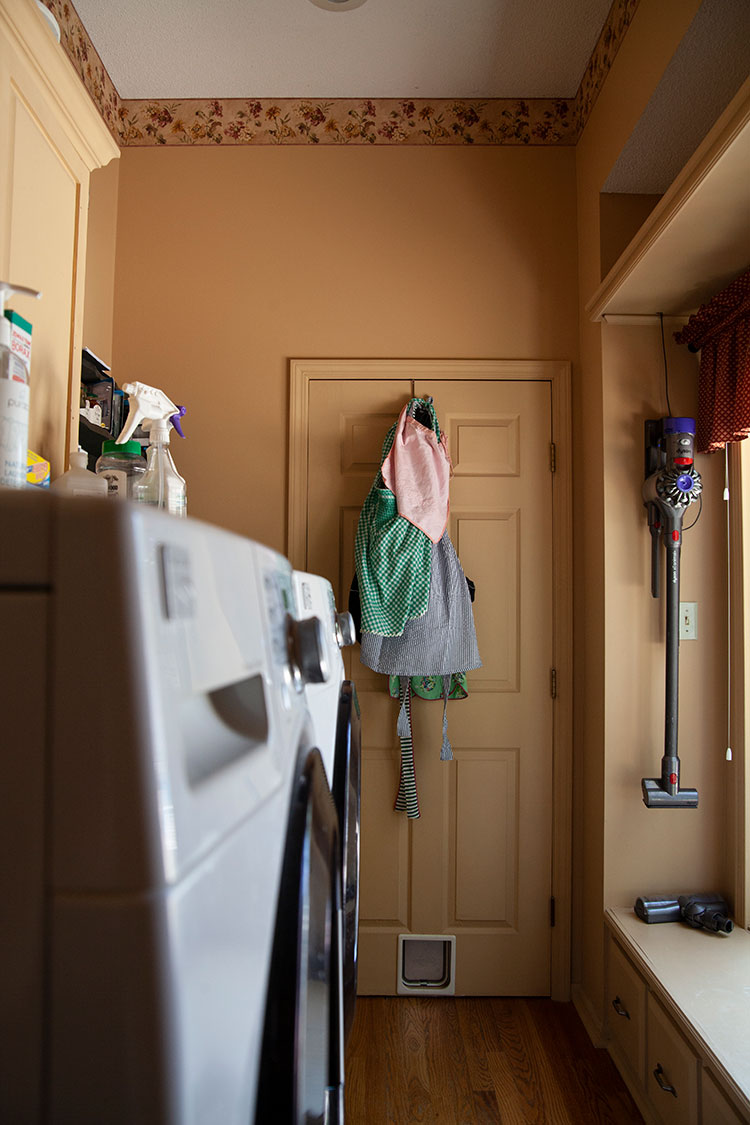
Let’s talk about how this room needs to function. The washer and dryer used to sit in the middle of the long wall. While that seemed like a fine idea, they stuck out further than the cabinets and made the space feel even more narrow. Because the room is tall and long, I decided to shift the washer and dryer to the short wall on the end and stack them to maximize space. I’m tall enough that the height isn’t an issue. Moving the water and electrical took some time and money, but I think it will really be worth it. Because the washer was going on an exterior wall, Micah built the wall out four inches so the pipes wouldn’t sit on the exterior wall. You always risk pipes bursting in cold weather when they sit so close to the elements, so if you can sacrifice the space, it’s always best. After lots of research, we went with the Samsung AddWash front load washer and dryer. They are one of the highest rated appliances and they come in a great black stainless that will blend in nicely with the cabinets.
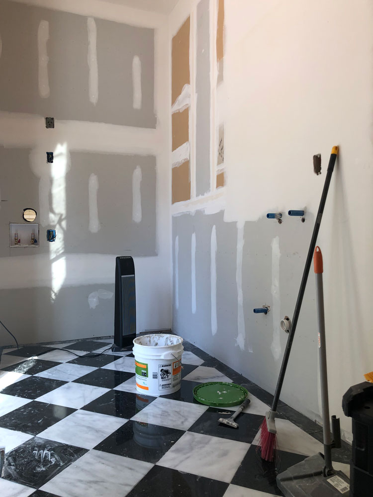
I’ve never had a laundry room with a sink. When my kids were little, a place to soak baby clothes covered in spit up and blow outs was something I dreamed of. Now I dream of a place to soak football jerseys and baseball pants. Adding a sink was a must, and we ended up with a great one. When we renovated Xander’s bathroom I picked out a sink that was way too big for the space why you should always measure twice and also take into account most sink measurements are the inside of the basin, not the overall inches. I ended up finding an antique Kohler for his room but held onto this one knowing it could be perfect for the laundry room. We also roughed in for a water spigot under the sink for something special that will bring additional function.
When it comes to the aesthetic details – the room needed to be one that I felt happy to be in, while still flowing with the kitchen. I knew wallpaper would do wonders. When I started looking for something that was a fit, I kept coming back to this toile. It’s classic but playful. In my first Home Ec class they started calling it Family And Consumer Science that year, and I could never get used to that our first sewing project was a pillowcase. The class was filled with bright, colorful fabrics fit for pre-teens, and there I sat sewing up a black and cream toile to match my chaise lounge I had received as a birthday present that year. Ha. The pattern has always stuck with me, and it’s a perfect fit for our colonial home. Mixing it with the more graphic floors and lots of black the countertops will go dark keeps it from feeling too precious. I’m also planning to use the paper in some unexpected ways to keep it fresh.
I don’t want to give too much away before the big reveal, but here’s a look at some of the elements. You can find links to some of the products below. Cabinets are going in soon and then the room will come together rather quickly!
I’m currently leaning towards orange as an accent color. It feels fresh and clean to me, what do you think?
See the detailing for the laundry room and reveal here.
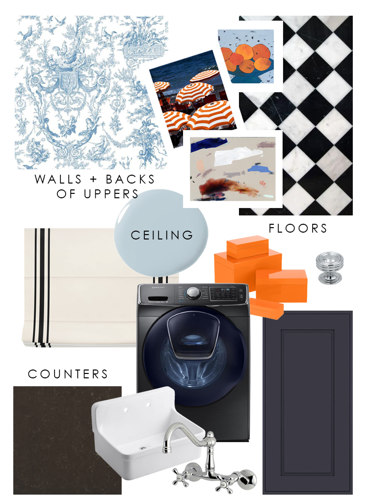
WHITE FLOOR TILE | BLACK FLOOR TILE | KNOB | CABINET PROFILE | FAUCET | SINK | COUNTERS | WASHER | DRYER | WINDOW TREATMENT | WALLPAPER
LET’S CONNECT! FIND ME ON…
INSTAGRAM | RSS | FACEBOOK | PINTEREST | LINKEDIN | EMAIL | YOUTUBE
Looks incredible! Another great job – so excited to see it come together 😍
Thanks so much!
And I thought I was the only one that still appreciated toile. I never see it anymore. I’m so glad you’re using it.
And most folks are afraid of orange. I’ve never understood that. What’s it ever done to them? LOL
Of course here in Chicago blue & orange represents our football team. Go Bears!
You’re going to love being in that room.
Ha, yes, two great things! Thanks so much, Mary!
How cute !! I have that same set of washer/dryer and it is so nice to be able to add something to the load whenever you want! I’ve never had a problem with it pausing or unlocking and after spending two weeks in England this summer with some of the WORST front loading washing machines I’ve ever used I am even more grateful for them 🙂
I love hearing that! Thanks so much for sharing!
I can’t wait to see the finished room! The toile wallpaper seems so fresh and unexpected, which I love. I have a practical question. Where are you doing your laundry while this room is taken apart?
Thank you! My parents live down the street, and they’ve been nice enough to let us do it there. 😉
Those floors and that wallpaper- OBSESSED!!! Had no idea you could find such GOOD wallpaper at LOWES of all places.
Thanks so much, yes, lots of great things!
Wow! the floor and the wall is very beautiful <3 is it your floor is a combination of black and white tiles? Thank you for sharing your design.I will surely apply this for my future projects especially in drywall.