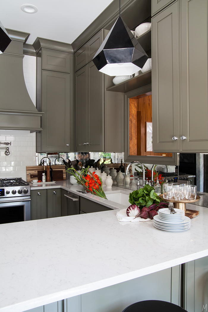
Every space I create usually has a mix of high and low elements, things that I saved on so I could splurge elsewhere. We saved a ton in the kitchen by doing much of the work ourselves and using all in-stock tile, but there was one place I was determined to splurge: the backsplash. I’ve seen mirrored backsplashes done behind bars, but I’d never really seen it done in a kitchen. I love the reflectiveness and interest antique mirror adds to any space, so I thought “why not add that to a kitchen?”
THE WHY: Other than the pure beauty of it, I also knew it could help our rather tiny kitchen. This room is one of the smallest in the house at about 10×10. The hallway going through and the big bay window make it feel larger, but the workspace itself is not big. I had thought about opening it up a bit, but taking down walls would mean loosing a formal dining room which I like having or loosing the only substantial wall in the wood-paneled room no longer making it feel like a wood-paneled room. Plus, I like that our kitchen is open to other spaces but closed off enough to hide the messes. So how to open up the space without actually opening it up? Mirrors.
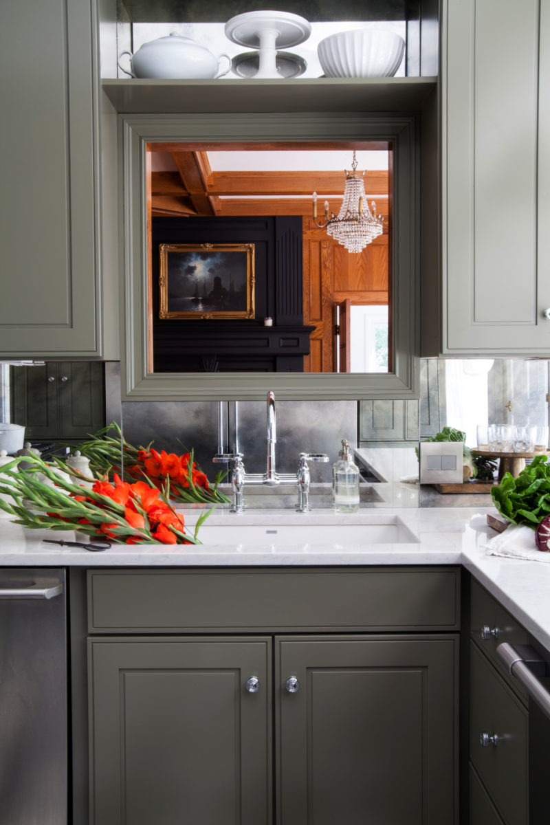 When I mentioned I was doing this I certainly got a lot of mixed reviews about it on the blog, and most of them were completely valid points. The thing with a reflective surface is it doubles everything. So if you’re the type who keeps lots of decor, appliances, snacks on your counter then this is probably not the approach for you. Your clutter will be multiplied. But I prefer a really clean counter. We took steps to ensure there weren’t appliances on the counters, and I typically only have a set of canisters and some cutting boards setting out.
People also questioned how dirty the mirror would get, but I haven’t found this to be an issue. The antiquing hides most of the water spots around the sink and a squirt of window cleaner a few times a week is only a few seconds of my time for a fresh start. Cleaning the solid surface verses something with grout lines is much easier too.
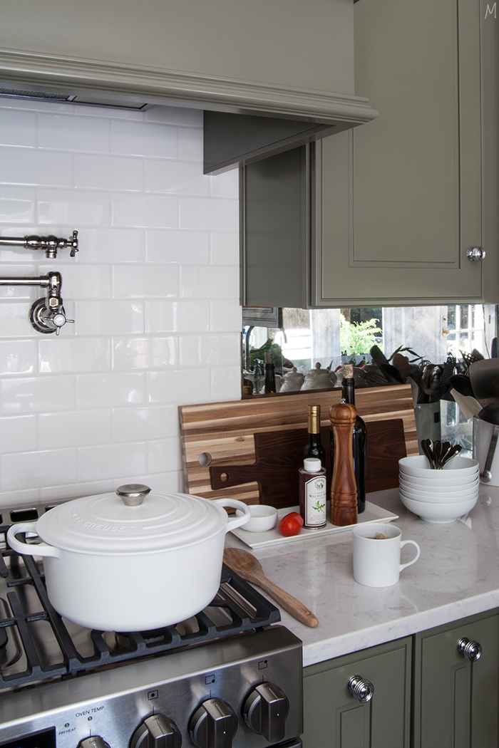
One tip I received from a reader that I am forever grateful for is to not mirror behind the range. I had planned to take the mirror all the way over, but it was brought to my attention that you’d be stuck staring at yourself the entire time you stood at the stove. Not such a great view at 8am, huh? I ended up stopping the mirror at the end of the upper cabinets, and it’s the perfect amount. It’s not at a height where I am constantly catching my reflection, but it makes the kitchen appear larger and the kids love it because they can wipe their faces in front of the sink and see if they actually got it all.
It also helps with the passthrough window. The passthrough was another element I debated on for months before deciding to keep it. I understand that it is known as a dated feature, but it’s so functional. I love that I can see the door to the kids’ playroom from it, and it does help make the kitchen feel more open. Closing it up would have also been tricky with refinishing the paneled wall on the other side. Taking the glass above the window creates a wall of reflectiveness that makes a softer transition as you look through to the other space.
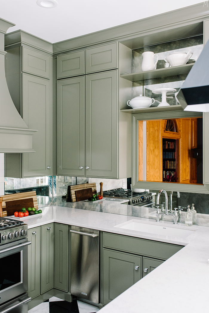
TO BUY OR DIY? I did consider and research DIYing. When mercury glass became such a trend a few years back the internet was flooded with tutorials. We could of had glass cut to size, mirrored it ourselves and then antiqued it. But having glass cut to size isn’t super cheap itself, and I knew it would probably never look as good as I had hoped. Did you know mirror patterns are owned by manufacturers? This particular pattern is called Summer Cloud and it took me weeks to decide which pattern I wanted. Just as fabric and wallpaper companies own the right to patterns, glass companies own the rights to antique mirror. Crazy. Going this route meant that I got a consistent pattern and paying someone else to install it ensured we weren’t liable if something went wrong I just saw me spending hours trying to mirror and antique and then something breaking when we went to put it in. DIYing most of the other details in the kitchen made it easy for me to say no to DIYing this.
THE COST: This is not a cheap treatment. I knew that going in, and prepared myself to pay. The mirror plus installation ran us around $850. I can’t tell you how many times Micah said to me throughout the reno “can’t we just tile this area and call it a day? We could save so much money!” And he was right, tiling that space would have been a fraction of the cost, but the results would not have been the same. The mirror opens the space up and adds interest in a beautifully subtle way. Design is in the details, and this detail is one of my favorites.
What is an element in your home that you splurged on and are happy you did?
The inspiration for our kitchen can be found here.
I love the kitchen! And I think the mirrored backsplash is the perfect choice in it. Would you mind sharing the sources of the cutting boards?
Sure! The largest is from IKEA, the one in front of that is World Market, and the one on the counter is from Homegoods. Thanks, Lauren!
Thank you!!
Can you share th married backsplash source?
Hi Kelly! I used Fountain Glass here in the Kansas City area. They were recommended and were definitely very knowledgable on the product. Most glass companies should be able to assist you, but I found that many of them seemed less familiar with it, so that’s why I went with fountain. Hope that helps!
It all looks amazing! Amazon sells glass cleaning cloths that are great. If you just use a wet microfiber cloth and then dry with these, you don’t need any glass cleaner. Ever.
Ooh, that sounds amazing, Sara! I’ll have to look into it, thanks for sharing!
Love the mirrored backsplash – it totally makes the kitchen! And it just goes so well with those green cabinets!
xo,
Kira | http://www.theimperfectionistblog.com
Thanks, Kira! We really love it. 🙂
Yah, thanks for this post I have been waiting to hear your thoughts on the mirror splashback, I think it looks amazing and love the readers comment of not doing it at the range, that makes so much sense. I’m interested in knowing what Micah thinks of it know that it’s installed?
I think he likes it. He does oh and ah over it, ha, but I know he understands why I wanted to do it more now. It’s usually not until everything goes in that he understands why I chose what I chose. 🙂
I’ve drooled over your mirrored backsplash since you posted the pictures. So chic, and it really elevates this space. Love it so much!
Thanks so much, Victoria! It definitely brings another element to the space!
Your entire house is amazing. What excellent taste you have. I am a retired art teacher now doing freelance work. Your use of strong color throughout many of your rooms is drama at it’s best and must be wonderful to live in. So many would shy away from the color. Bravo to you!
Thanks, Dianne! I do love living in it!
It certainly visually expands your kitchen. Love your choice of mirror!
Thanks, Joanna!
I think this is such an unusual and stylish element in your kitchen. Definitely going to keep it in my own idea file for future projects. Thanks for the inspiration!
Thanks, Amy!
Love Love Love
Thanks, Sandra!
I just really enjoy your posts. Your tastes are different from mine, but none the less, I like to see what you’re doing and read about it. Your kitchen is nothing like I would choose for myself, but I find it so dreamy. I like all white with some color thrown in, but your colorful rooms I find enticing. I keep trying to put my finger on what draws me in. Did you once say that you considered yourself a traditional minimalist?
Hi Lela, thank you so much! To hear that I don’t have the same style as you, but that you still appreciate what I do really means a lot! I definitely feel traditionalism is the foundation of my style, and I lean minimal for the sake of practicality and my family. My husband prefers it, it’s easier with kids, and it’s a lot less to dust! 😉 Thank you so much for reading!
I found it interesting that the mirror companies have their own patterns. I love the one you chose, so soft and dreamy and classy at the same time. I grew up in the seventies and mirrored glass was big but not well done, but yours is everything antique glass should be. Great call.
Thanks, Lori! You’re right, anything with too much pattern can look dated really fast. I definitely wanted something that was subtle and classic. 🙂
Love it! Your house is beautiful! Quick question…how did you finish the seam where the backslash meets the counter?
Thanks!
We just ran the tile pretty much to the mirror and then grouted in that space. It’s a pretty clean look!
Hi! I looked through everything (and comments) and didn’t see a link to the mirrored tiles? I’m doing a kitchen surface re-fresh and would love to get a sample to test if it would work in our smallish kitchen. It looks just wonderful in yours. Thank you!
Hi! They’re actually sheets of mirror cut to size by a glass company. This exact pattern is called summer cloud, I believe. I found several local glass companies did this treatment…best of luck!
Hi! They’re actually sheets of mirror cut to size by a glass company. This exact pattern is called summer cloud, I believe. I found several local glass companies did this treatment…best of luck!
Beautiful work!! I love the use of an antique mirror for a backsplash and have seen this sometimes done in NYC or smallish apartments for a quick fix. And, I’m having a thing with green lately……would you mind sharing the color you used on your kitchen cabinets?? Thanks!
Hi Fran! The cabinets are Kraftmaid and the color is Sage. I love how it’s a very neutral green. Thanks for following along!
I just discovered your blog and I am hooked! Your kitchen, dining room and library are stunning! I can’t wait to see what you do with the rest of the house.
Thanks so much, Lori, glad you found me!
Hi there. I love the kitchen and also am considering a mirrored backsplash but my contractor says the glass by the sink will eventually etch and not look so good. How is your mirror holding up by the sink and does it get wet much? Thanks so much!
It looks great almost a year later! It gets wet here and there, but since our kids are still young it’s mainly me and my husband using it. Also, because it’s antiqued, maybe that would mask it if it did get some etching? It wasn’t something our glass company brought up and they do this quite frequently. Hope you can make it work!