*This post is in partnership with Lowe’s, but all thoughts, opinions, and selections are my own.
Renovation is full of decisions. Choices can make or break a space, and design is in the details. A room makeover comes with tens if not hundreds of little decisions to be made, but there is one choice that can completely change the feel of the room. The greatest impact you can make in a space is what you put on the walls. Paint is powerful. Because it’s so powerful, it can be a bit intimidating. The idea that you could choose the perfect color to take up hundreds of square feet from a swatch not much bigger than a postage stamp is unrealistic.
But picking a paint color doesn’t have to be scary, it just has to be thought out. The choice can seem overwhelming, and there are so many variables that come into play. I’m not here to tell you how to make the decision quick or easy, for me, it’s probably the decision that takes me the longest to make in any space but I am here to show you the process I use that helps me get the color right the first time.
WHERE TO BEGIN: I’ll start by saying, don’t begin a room makeover with paint. I think most people decide they want to update a space, they paint the room, and then start looking for furnishings. I’m going to tell you to do the exact opposite. The reality is, that sofa you’ve been eyeing comes in a handful of colors. The curtains you found on sale are only available in one shade of green. If you’ve already painted your walls, finding furnishings that compliment the paint color, that are in your budget, that are the right scale for the space….there are just a lot of variables working against you. Paint comes in any color you could imagine. If there is not a chip that is to your liking you can add more black or white to make it what you envisioned. Paint is limitless, furnishings and decor are not. Have a color in mind, but purchase some of your bigger items for the room first. Then you can pick a paint color that compliments those pieces.
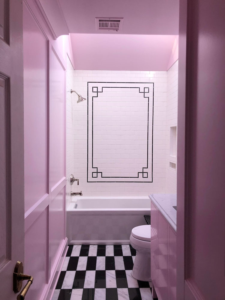
In the girls’ bathroom I knew I wanted the walls to be pink. But I sourced fabric for the shower curtains first. When the fabric was decided upon I started pulling pink paint colors that complimented it. If I would have picked the paint first I would have likely gone with a warm, blushy pink. But the fabric Milly loved most has cool-toned pinks in it. It would have never worked with the wall color I initially envisioned. Having a vision is important, but renovating in the right order makes it easy to tweak and refine as you work through the process.
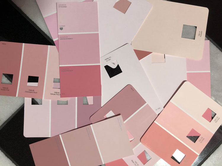
COLLECT ALL THE CHIPS: I used to be pretty stingy when it came to taking paint chips. I would go to Lowe’s, only collect what I really loved, and come home with four to five different shades to test in the space. Trial and error has taught me that you can never be too greedy when it comes to paint chips. The color in the store is not going to be the same as the color in your room. Things are going to look different, so if I even remotely have a thought about a chip I pick it up and take it home. I’d much rather feel like I got more than I needed than have to go back to get more.
NARROW THEM DOWN: When I get home I lay all of the chips out in the room and stare at them. I’ve talked about this before, but if your room faces north or east, the colors will read cooler then if it faces south or west. If I have a piece I’m trying to compliment like the girls’ shower curtain fabric I get that out and put the chips all around it. I start pulling out the chips that are not working: too dark, too orange, too muddy. When I have it narrowed down to a few I will leave them there and check back in at different times of the day. How does it look at night? With the lights on and the lights off? When I get things narrowed down I also like to do a quick search on Google images and Pinterest to see the colors in other people’s rooms. You can’t always take it at face value thanks to filters, presets, and Photoshop but it can help give you a feel for how the color will go big in a room.
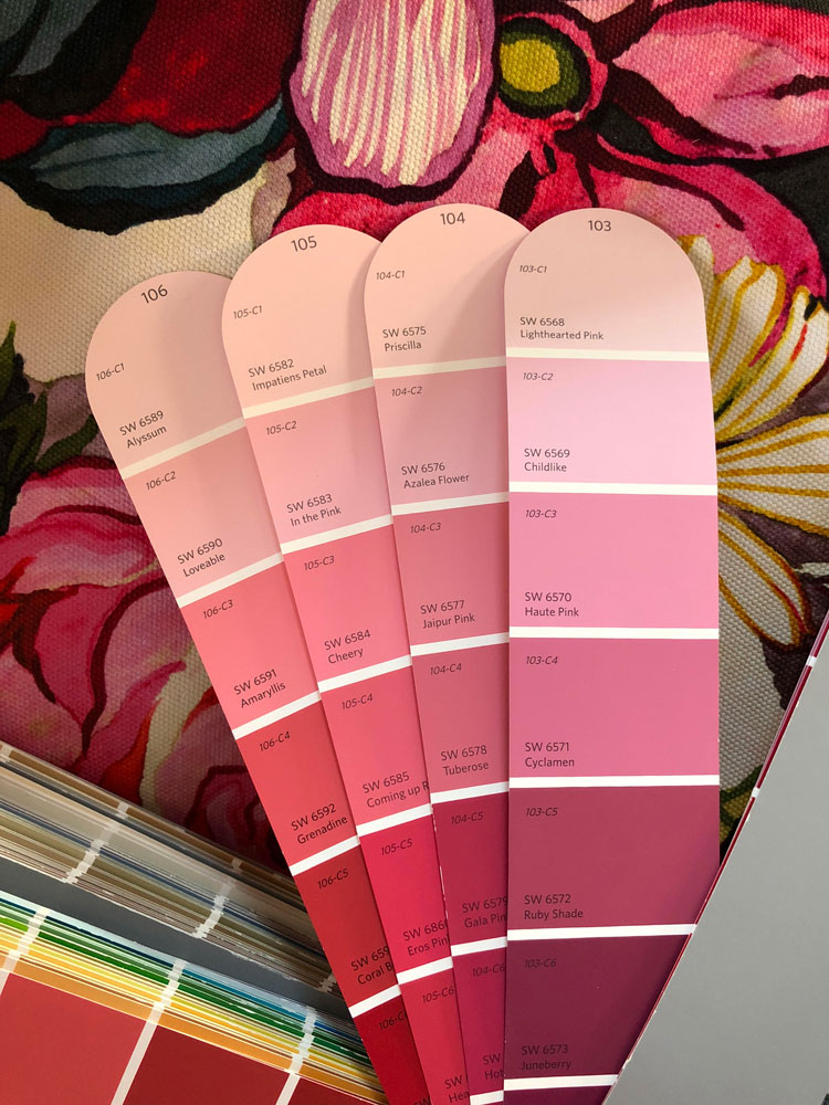
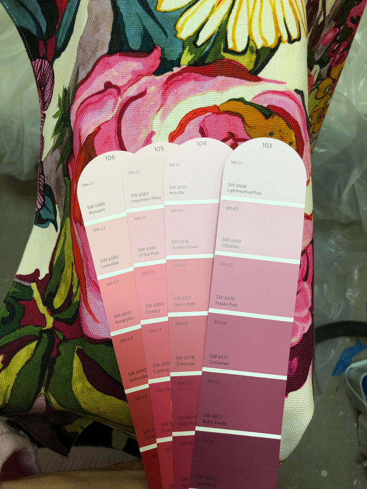
After looking at my top contenders at different times of the day, Childlike seemed to be the winner. I didn’t want the color to be too strong, so I played with percentages. You can ask for any color cut to any percentage. The paint experts at Lowe’s can help you with this. I tried it at 75%, 50%, and 25%. That means it’s that percentage of the color with white to lighten it. If you want to darken a color you can ask for it at 150%, for instance. This gives you a lot more options when you like a tone, but need a different intensity.
SAMPLE, SAMPLE, SAMPLE: This is a step I think a lot of people skip because it does cost money and time, but it’s the most important to getting it right. When I have narrowed the colors down to three to five, I head back to Lowe’s to get samples of those colors and put them on boards. If you can get samples in the sheen you’re planning to use, do it. The higher the gloss, the more light reflection. The more light reflection, the more you will see the undertones. Sheen will change the color. I always use my favorite brush to sample the paint, but if you don’t love washing a brush out in between each color you can pick up a pack of those cheap, foam brushes. I have a big pad of mixed media paper that I use for my sampling. I think in the long run it’s cheaper than buying poster board each time you want to test out paint. Don’t forget to label each sample, I just write the name with a sharpie in the corner. After staring at the colors for a few days it’s easy to forget which is which.
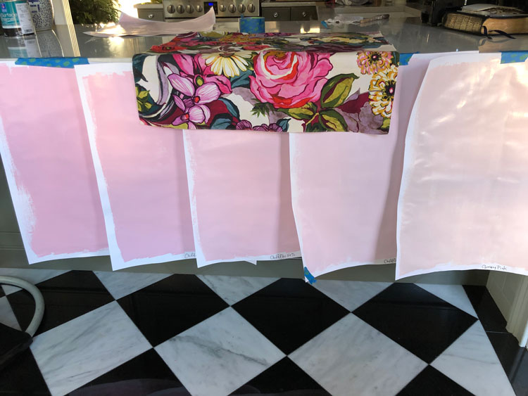
The kitchen gets the same west-facing light as the bathroom, and the floor tile is the same material. I spent a lot of time staring at the samples on the counter while Brian was upstairs prepping and priming the space.
OVER ANALYZE: This is the part where my obsessive side really shines, ha. Once I have the samples done I grab some painter’s tape and attach the posters all over the walls in the room. Paint will present itself differently on different planes, so you want to be sure to have the samples upright, not laying on the ground. I look at them on each wall, in corners, during the day and at night. It’s good to get a feel for how the colors come off in all the areas and times of day. If things are an obvious no, then I pull them. This keeps my mind focused on the choices at hand. At this point I have to remind myself that I have given this detail a lot of thought and that any of the options are going to be beautiful. There is no wrong choice now, just a choice that might fit my vision best.
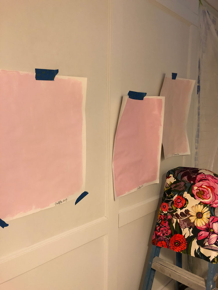
Because the girls’ bathroom was sprayed we do this when we want a glossy finish and when there is a lot of woodwork on the walls it feels even more important to get the color right from the get go. When you roll and brush on paint, you can get some on the walls, decide it’s not just right, and take the paint back to the store to be adjusted a bit. They can add more color, cut it with white to lighten it, etc. But when you spray, it’s pretty difficult to stop and reassess. That makes the prep and planning all the more important.
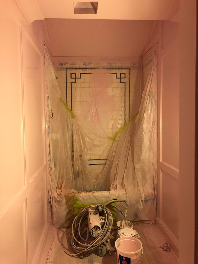
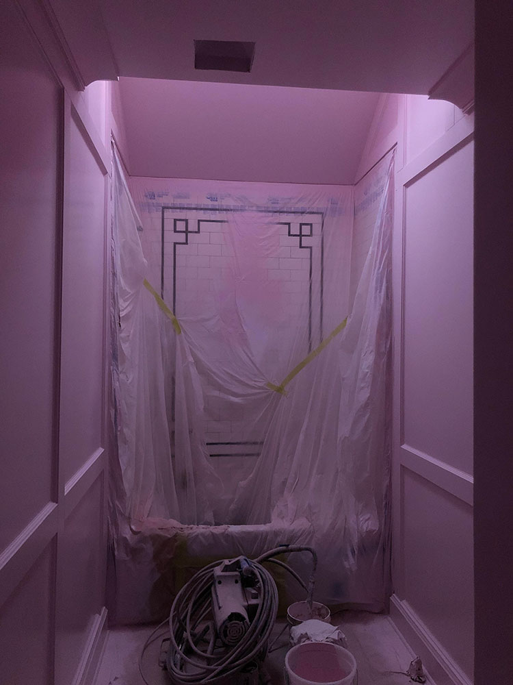
Pink is definitely a color that bounces light like crazy. It’s why everyone looks so good in a pink room! We ended up going with Childlike cut to 25% and it truly is perfect. A clean pink that feels fresh and cool but still brings warmth and energy to the space and people’s skin. We’re so close to the big reveal, I’m styling away and can’t wait to share!
Those are my major tips for getting paint right the first time, I’d love to hear any addition thoughts you might have. Be sure to leave them in the comments!
See the bathroom reveal here.
My love of thrifting is always fun to join. Do you @ThriftWithTheMakerista?
Join Thrift Club for $35/year and follow along on on my private Instagram account; also, join the 1000s of members in the thrifting community on The Thrift Club Facebook Group and Market!
Are you shopping for a thrifter or perhaps want to splurge yourself, checkout Thrift Club merchandise.
LET’S CONNECT! FIND ME ON…
INSTAGRAM | RSS | FACEBOOK | PINTEREST | LINKEDIN | EMAIL | YOUTUBE
I am going through this right now in my office. I know the color palette I want and currently have 3 sheets of paper pinned to the walls with paint samples painted on them. They have been there for about a week so I can see different lighting. I love these tips! One thing I also do is if I’m at Lowe’s it take the paint chips outside (usually to the garden center) and look at them in the sun to help narrow things down a bit more. I also take pics on my phone to see how colors photograph.
That’s a very good idea too, thanks for sharing!
Loved reading through your process! Does adding white and black to the paint just change the paint’s intensity (from lighter to darker)? Or does it change the color? I’ve been curious when people say they mixed a custom paint color. I always wonder: how did they know what colors to add and how much of each color to get their desired outcome? I’d love to hear if you’ve done this and your thoughts on that process 🙂
Yes, it just heightens or lowers the color’s intensity without changing the tone, it’s a great tip! I’ve never done custom that way, so I wouldn’t know. I think most people that go custom have the color matched to something they already have, like a fabric or paper.
Thanks for sharing your tips. I use a roll of butcher paper ti sample one. You can get nice long strips and it is very affordable and easy to store.
That’s a really great idea too, thanks for sharing!
Love your advice. The right colour takes time! I’d never thought to reduce or increase the intensity. That’s a game changer! My mother in law once said just pick the colour and if you don’t like it you can just put it on one wall. Your approach is more me. I did similar with my living room and 5 years later I still love the colour.
It really is! Glad you still like it!
Great tips, thank you so much for sharing! People often feel like painting the walls first and then choosing furniture is some unwritten rule, but it’s actually quite the opposite. I love how you’ve explained the reasons behind this so clearly. The process you’ve gone through in choosing your wall paint is incredible and I love that you went with this nuance of pink. Can’t wait to see the end results!
Yes, agreed! Thanks!