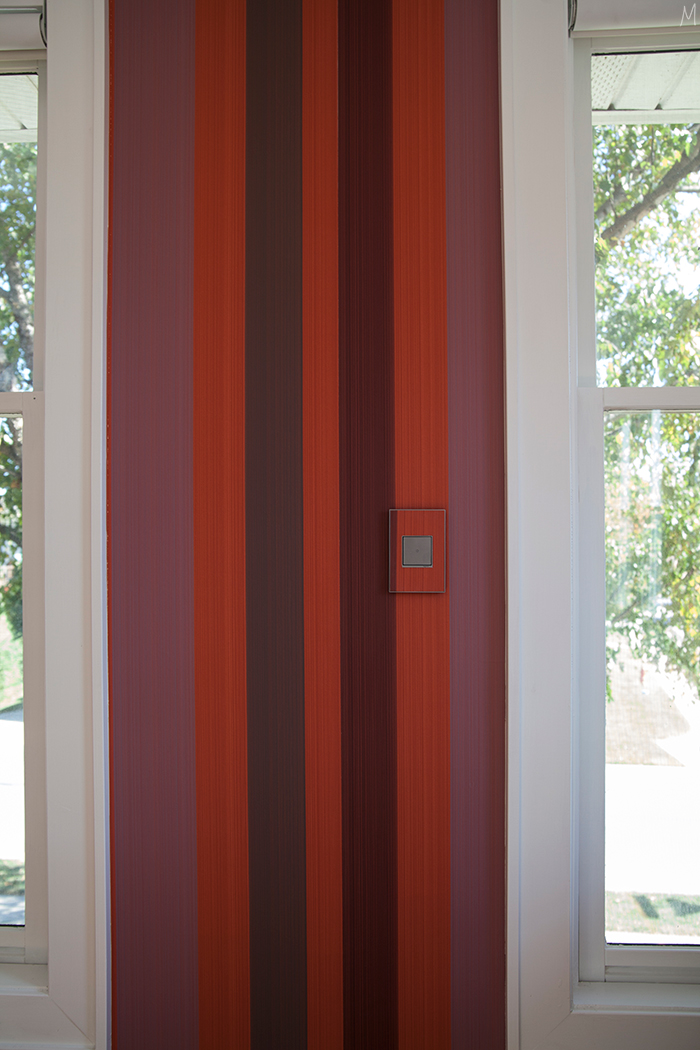
How are there only two weeks left? Week four is upon us, and while the big things are in place, it seems like I am freaking out about missing/complicated details daily. While I love details, I’m usually best at seeing the big picture of a space and forgetting that the details are crucial and need planning. That’s why I tend to take my time with spaces, instead of rushing to finish. But doing the ORC in the past definitely has shown me there is something so wonderful about having a space feel finished in less than a few months!
In case you’ve missed the journey thus far, here is week one, week two, and week three.
Today let’s talk wallpaper and a few of the more permanent details that have come together. The wallpaper is really the star of this show, and once it went in my hopes were confirmed…it’s incredible!
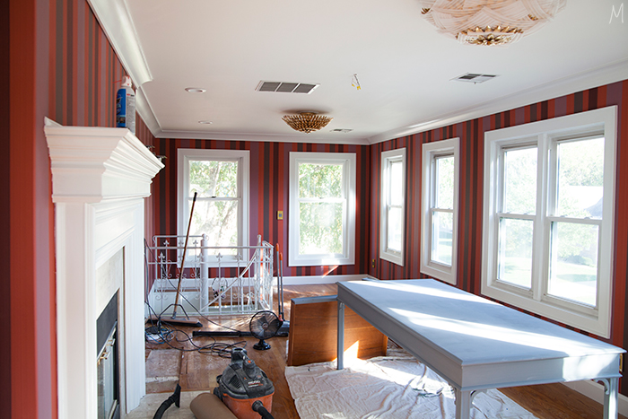
Would you believe it wasn’t in the original plan? I actually designed an entire room around a different wallpaper. Things didn’t work out with that paper, and I was left feeling defeated. But then I started browsing through Farrow & Ball’s offerings, and when I came across the Chromatic Stripe it just made my heart sing. The stripe is so classic, but the colors are unexpected and fun yet sophisticated. I quickly reworked the plan, and this became the jumping off point.
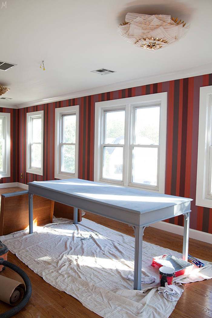
The desk all primed and ready for paint.
Some people might think you can’t do bold paper in a room with low ceilings and so many doors and windows, but I think it’s the perfect space for just that. Not only does the paper bring life to the space, the windows keep it from being too overwhelming, and the green of the trees outside really pops now. It feels like you’re in a treehouse!
Micah and I tackle a lot on our own, and while we’ve done some wallpapering in the past, like this mural this is designer paper. It’s a little more delicate and with a stripe, I didn’t want to take the chance of hanging something wrong. What would have taken us days didn’t cost us very much to hire out, so we brought in one of Micah’s sub contractors to do the work.
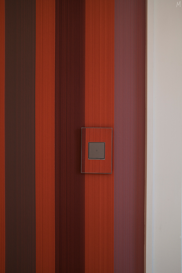
A detail that really makes the paper? The switch and outlet covers. We stuck with our favorite touch dimmers and pop out outlets from the adorne collection by Legrand for the space, and the customizable plates are one of those details that just elevate a room in no time.
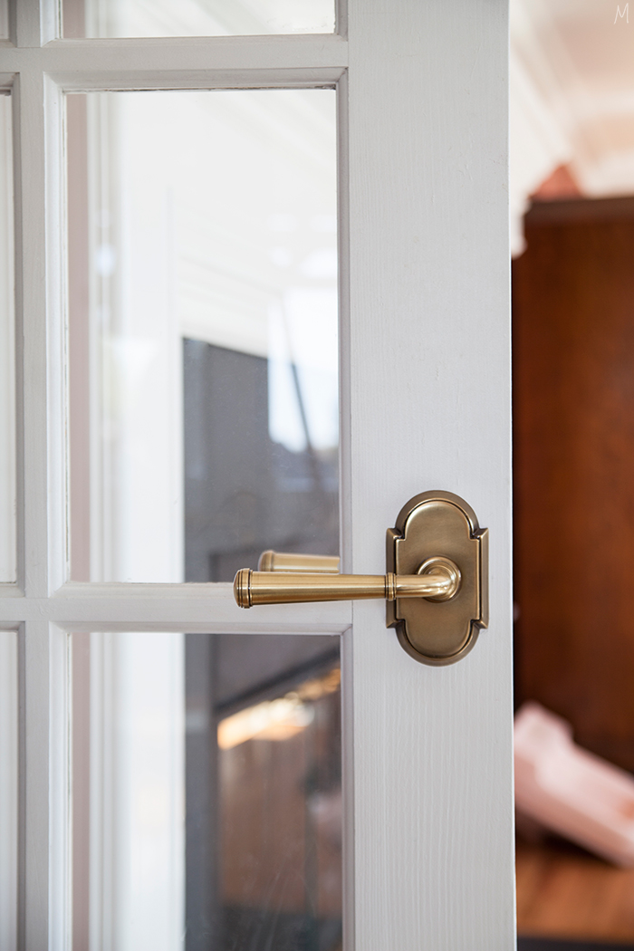
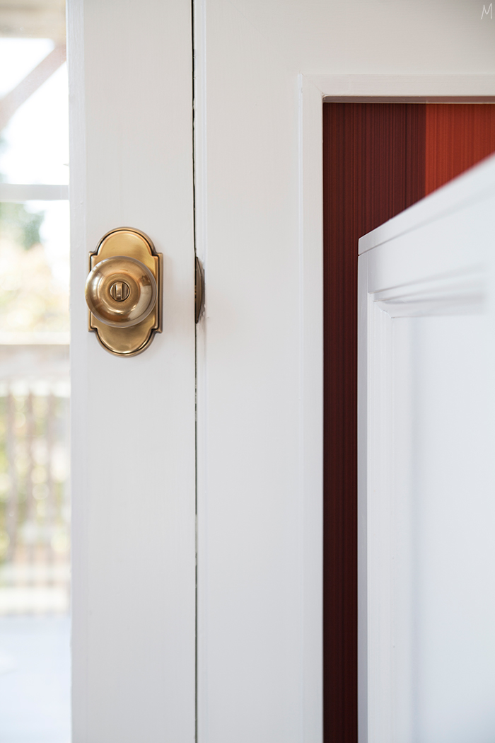
Details you touch daily really do matter, like the switches, and the same can be said for door hardware. Shiny, 90’s plated brass will never feel incredible, so switching it all out to these Emtek Merrimack levers and Providence knobs is something we’re doing in each room as we renovate our way through this house. Not only are they pretty, they are heavy, and that weight just feels so much nicer as you open and shut doors throughout the day – small details that silently speak volumes.
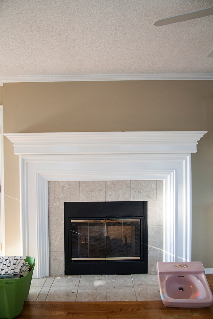
Let’s talk fireplace surround. Our whole house is tiled with this tile. Whoever remodeled clearly got a great deal, as it’s on floors, surrounds, and it was the kitchen counters, remember? I’d rather not too. In an ideal world I would have had a slab of stone cut to fit around the fireplace for something really sleek and clean. But it’s an expensive treatment, and the way the mantle has been built with all of the layered details would not make sliding something in on the floor an easy task. Sure, we could have retiled, but tile felt like settling for me. I didn’t want to take the time and money for something I knew wouldn’t be exactly what I’d hoped for. When it comes to affordable DIY I almost always turn to paint.
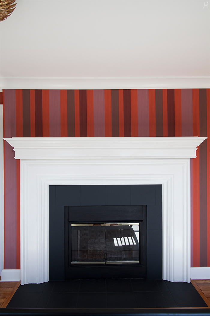
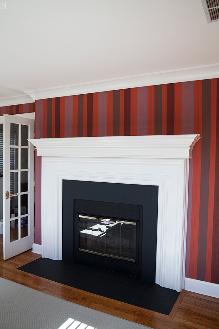
I used Farrow and Ball’s exterior masonry paint in Off-Black, sanded and taped off the tiles, and spent an afternoon applying a few coats. The flat finish helps the tile blend in and it’s a clean, updated look for almost no money. Now that the bones are about done we’re starting to move in furniture, and I’m getting a better sense of what’s left to do. We’ve had and continue to have lots of hiccups daily, ha, but overall it’s coming together. I think if I can go a few more days before this baby comes I’ll feel good about where we’re at and still have some time after it’s arrival to finish styling and shoot the space before the big reveal in a few weeks!
Need to catch up? WEEK ONE | WEEK TWO | WEEK THREE
In the meantime, be sure to check out all of the other wonderful featured designers updates this week…
Jana Bek | Chris Loves Julia | Shannon Claire | Coco.Kelley | The Curated House
Driven by Decor | The English Room | From the Right Bank | Sherry Hart
Hi Sugarplum | House of Jade | Hunted Interior | The Makerista | Making it Lovely
Marcus Design | Pencil & Paper Co. | Megan Pflug | Place of My Taste | Suburban B’s
Waiting on Martha Media Partner House Beautiful | TM by CIH
Thank you to all of the wonderful sponsors and partners who have contributed to this space, including Farrow & Ball, Emtek, and LeGrand.


Love love love the wallpaper!
Thank you!
This looks fantastic! The wallpaper is gorgeous and that desk is divine.
Thank you, we’re getting there!
Dying….dying….dead. It’s gorgeous.
Ha, you’re funny…and sweet. I’m really happy with how it’s coming together!
It is amazing!! And you are superwoman keeping up with all of this with baby #3 on the way!!
Maybe more like crazy woman, but thank you, Chrissy! 😉
I straight up LOVE this!!!!! That wallpaper is so good. And kudos on the simple DIY with the fireplace tile.
Thanks, Erin! Yes, I love a little DIY mixed in where I can save money and still get a nice look!
Looks incredible! Painting the fireplace surround=totally brilliant! I love how the black contrasts with the wallpaper!
Thank you! I mean some marble would be stunning, but it’s great what a little paint can do!
WOW! I really love how updated and bold the fireplace looks now and especially surrounded by that paper!
Thanks, Michelle! Paint to the rescue!
Superwoman! Looks terrific.
Thanks, Dianne! 🙂
OMG….that wallpaper is so perfect! I love the colors and the fireplace makeover is perfect! This room is gonna sing:)
Thanks, Sherry!
Now that room has serious wow factor!! You are amazing to achieve all this in final stages of pregnancy – I admire your hard work.
Thank you, Claire! My husband can take most of the credit on the hard work part, but I’ve been trying to help where I can. 😉
Everything looks beautiful! I really, really like what you did with the fireplace. The black really makes the wallpaper pop and it makes the fireplace feel more important. I would not have been gutsy enough to pick the wallpaper but it looks amazing in the space. The number of windows really do make what could be a dark room feel much lighter. Beautifully done!
Thank you, yes, the paper was a risk but it’s also a classic so I knew it had great potential and lasting power!
The bold and the beautiful. Love it! Gorgeous transformation.
Thank you, Nicole!
Looks fantastic, Gwen. Love the door hardware!
Thanks, Wendy! Hope you’re doing well!
Wow, Gwen! This one took my breath away! When I saw the plan for the wallpaper at first I thought it was going to be so wild, but with all that gorgeous white trim- it’s just perfect! And the fireplace? It just SINGS. What an awesome, awesome update!!
Thanks, Jen! I love hearing that it turned out better than you expected. 😉 I think my husband felt the same way, ha!
I would love to paint the tiles surrounding our fireplace as well as the tiles right in front just as you did. A quick question… are you at all concerned about the paint on the floor tiles getting scratched off? We have four kids so I’m imagining matchbox cars, etc. being ran across the painted tiles! ?
This isn’t an area that sees a lot of traffic, so it was less of a concern. But if you’re doing a high traffic area I would definitely recommend lightly sanding the tile to rough it up a bit, priming and then using an oil-based paint. A bit more work but it will definitely be durable!
Oh my goodness, Gwen, I didn’t realize you were so far along! You’re seriously blowing my mind – how do you keep up?!
Ha, thanks Oksana. I’m lucky to have a hardworking husband right now! 😉
This wallpaper is just as stunning as I thought it would be! ALL THE HEART EYES!
The wallpapered plates and outlets make such a difference, as do those wonderful knobs and handles.
Looking forward to the furniture!
Thanks, Ariel! Yes, the plates make such a difference in the end result…so glad you like it!
That wallpaper is just too good and looks STUNNING in that room! What a difference that paint made on the fireplace – wow! And I continue to bow down to you and your amazing super pregnant self doing all of this. I hope that baby comes at the perfect moment! I’m excited to see both your projects come to fruition!
Thank you, Tricia! I’m hoping so too! 😉
I love the wallpaper! The stripes help to draw your eye up and that definitely makes the ceilings look taller. Painting the tile surround was a genius idea. It now looks so custom. And I love the fireplace trim so much. It looks even more beautiful now, with the black paint. Can’t wait for this reveal!!
Thanks, Amber! Yes, I’m really happy with how the painted tiles turned out too!
I’m just in love with all of this. I can’t even tell you how jealous I will be over that desk. The wallpaper, that is such a happy surprise, it really does work out the way it is supposed to :).
It really does! Thanks, Linda!
LOVE this. I was skeptical of the paper at first but it’s perfect! Would you mind sharing the source of your light fixture? Thanks!
Thanks! Here it is: http://www.crystorama.com/crystorama-broche-6-light-gold-ceiling-mount_4765.aspx#.WBlCzzYtDX-
It looks so beautiful!! I love the wallpaper choice and think it looks great with all that amazing light. The fireplace turned out amazing. Love the light switches. I can’t wait to see more.
Thanks so much, Albertina! It’s coming along!