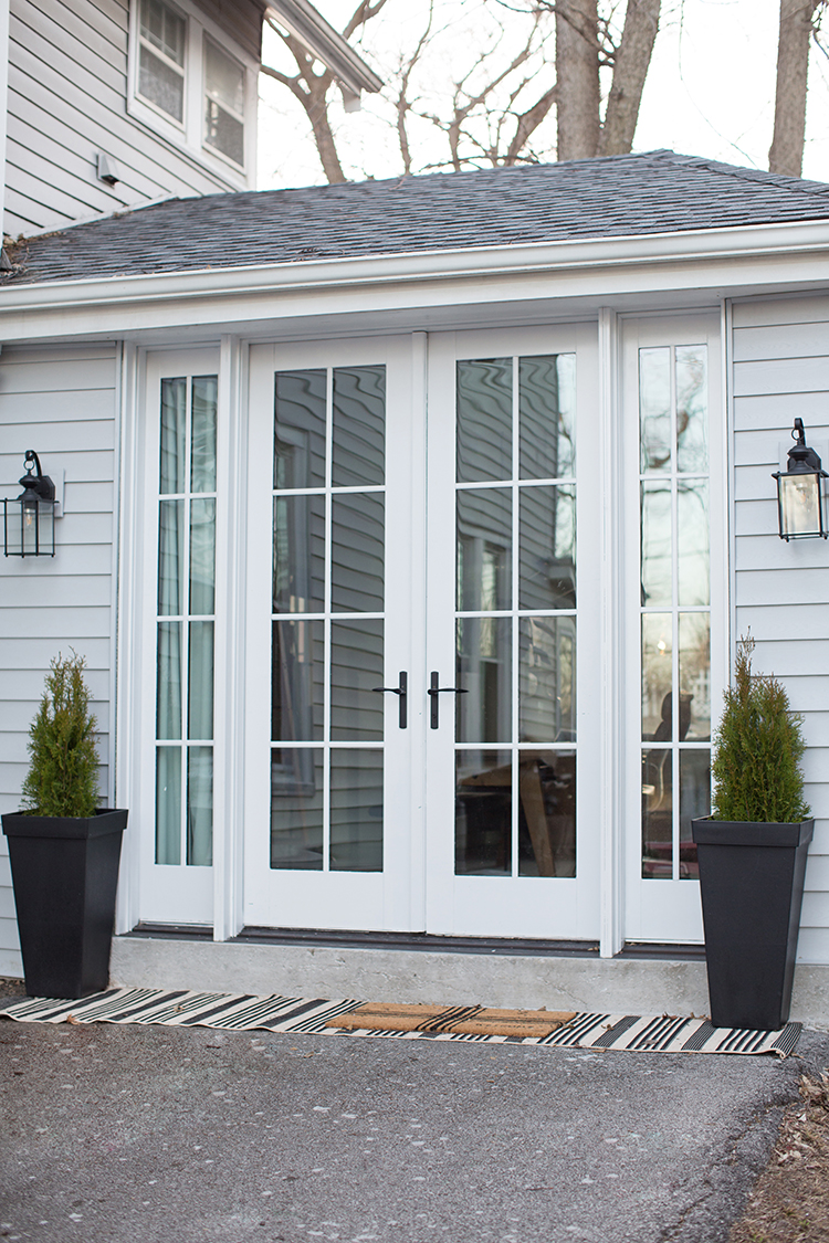
I talk about her often, but Laura is my design partner-in-crime. We love chatting all things interiors and helping each other along the way. We started with her living room several years ago and that now famous Billy bookshelf hack. Last year we tackled her kids’ room. This year Laura and her husband wanted to create some more space in their historic home without adding on. Storage is a funny thing. The more storage space you have, the more you tend to hold onto. Craig and Laura’s house has a single car garage attached that was only accessible by an exterior door.
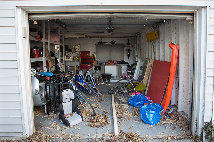
It wasn’t a space they pulled cars into, and it wasn’t a space that was very well loved. Filled with old bikes and things the family rarely used, the Kackleys had an idea to turn it into something they would actually spend lots of time in. As pastors of a church plant and small business owners, Craig and Laura both need space to work and meet with clients, members, and staff. This was the perfect solution for something at the house but separate from the rest of the living space. Anyone who does what they do knows how helpful it is to be able to physically separate work life and home life when possible.
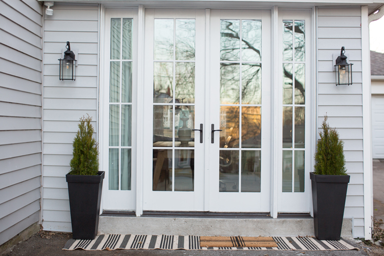
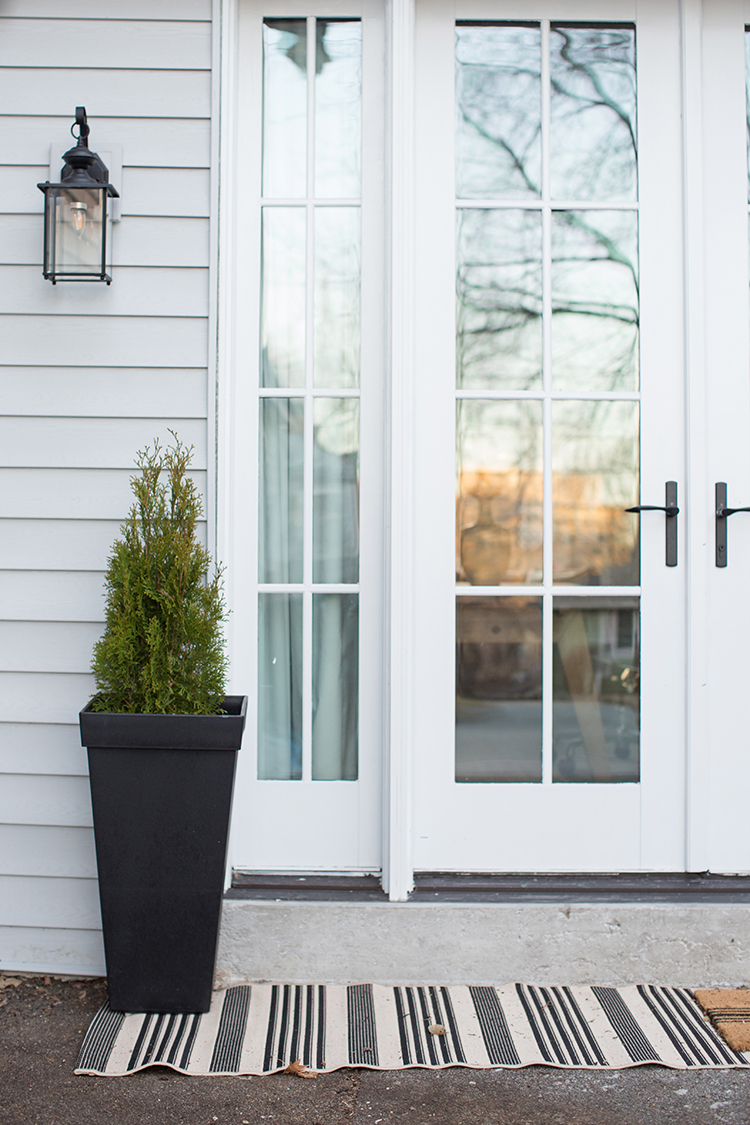
So they added a door from the house to the garage and got to work making the space a livable addition.
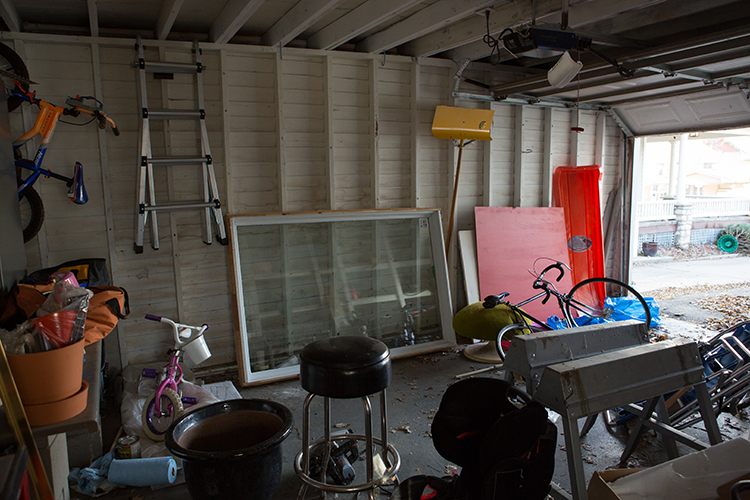
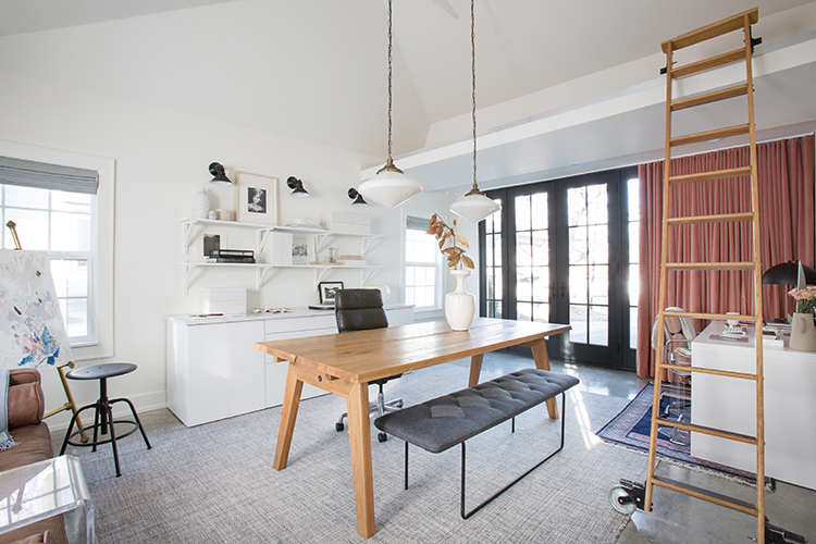
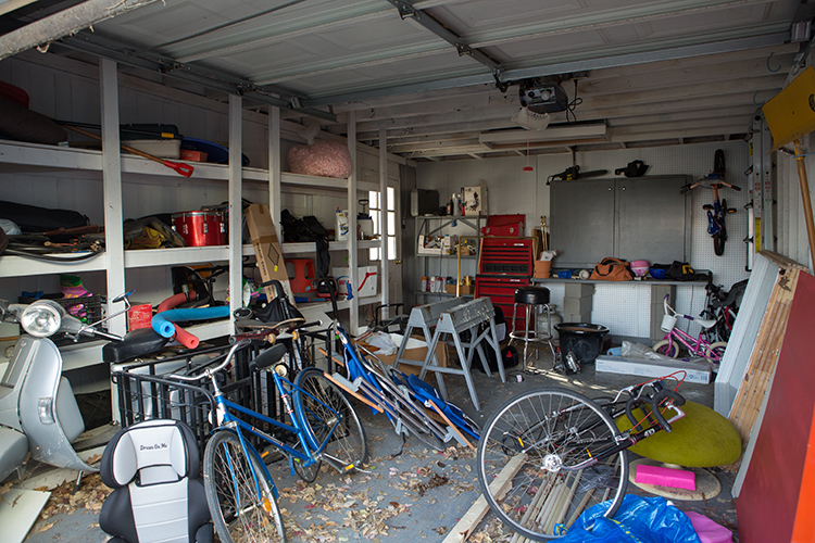
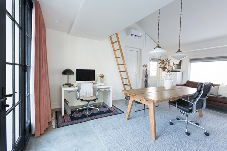
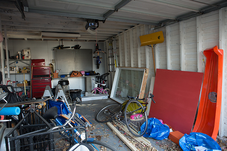
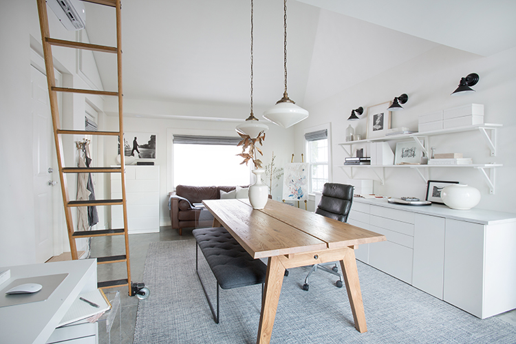
So much of this was done on a tight budget, specifically the build out. They hired someone to pour the slab and drywall, but Craig found a way to tackle everything else himself. He spent hours learning how to hang windows and trim on YouTube. Speaking of windows, Craig found all of them at ReStore and the double doors on Craigslist. Taking the low ceiling out and vaulting it really opened the space up. Adding the loft allows for product storage like Lindsay’s canvases before big shoots.
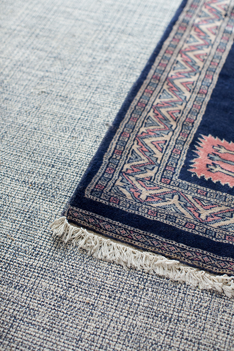
Along with functionality, the couple wanted a space that was calm and clean. The concrete floors and the white walls White Dove by Benjamin Moore keep the room quiet and airy. When it came to the furnishings we wanted simple while adding in some texture and warmth. The rug from Annie Selke brings subtle pattern to the ground and feels great underfoot.
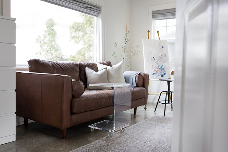
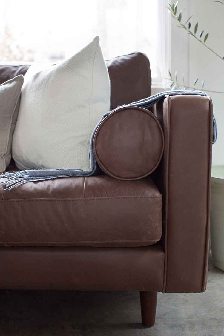 SOFA | ACRYLIC C TABLE | THROW
Craig is an early riser who starts his mornings out here on the sofa studying and preparing himself for the day. The Sven from Article is the perfect apartment sized sofa and just the right length for under the big window. It provides comfort and warmth to the more stark space without taking up too much room.
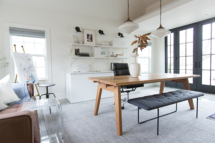
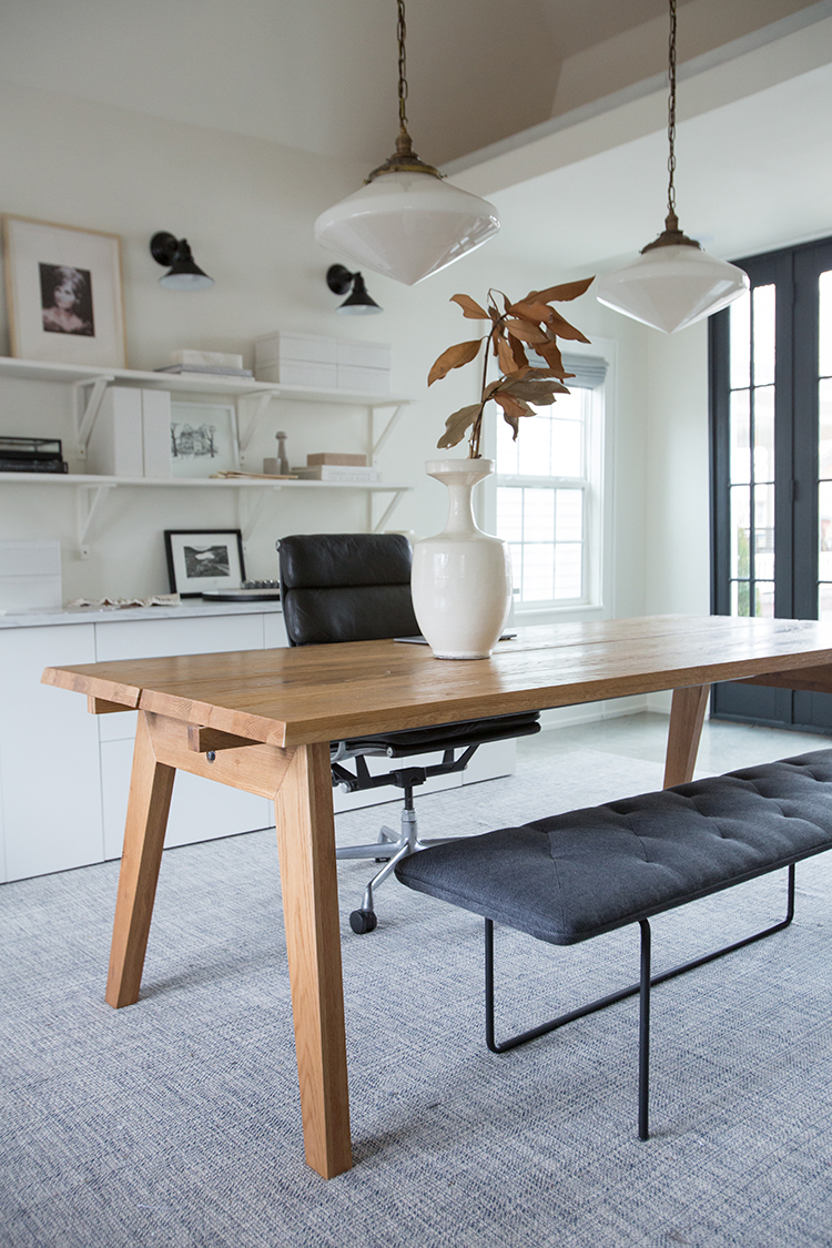
MADERA TABLE | EAMES CHAIR | HORIZON BENCH | VASE
Craig also wanted a space to prepare. From study time to sermon prep, he needed a place to meet with people and sprawl out notes. As a wedding photographer, Laura needed a place to meet with clients. The oak dining table is wonderful for Laura to sprawl out materials and perfect when Craig wants to have a staff meeting at the house. It comes with extenders that allow it to seat up to 12 people. For extra seating that doesn’t take up a lot of visual space, the Horizon bench tucks perfectly under the table. The pendants Laura scored on Craigslist and they give off such soft, beautiful light in the evenings.
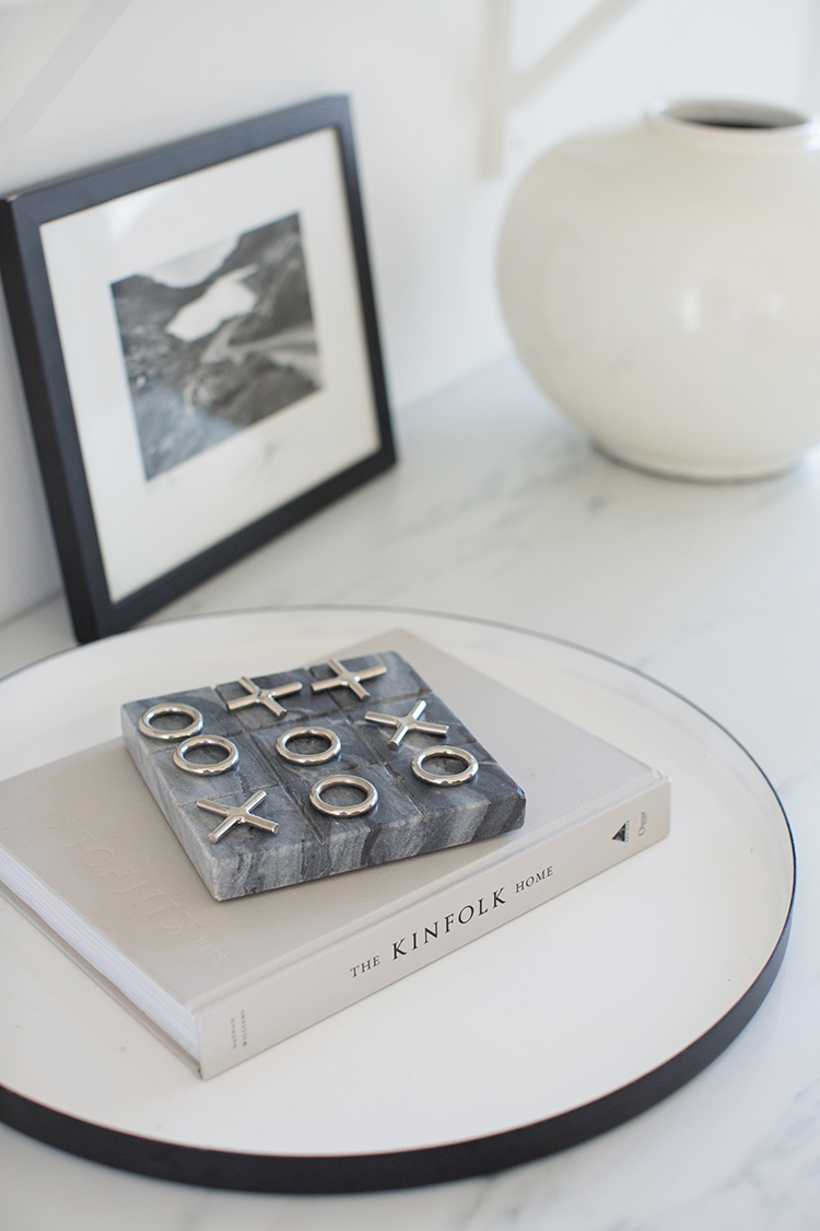
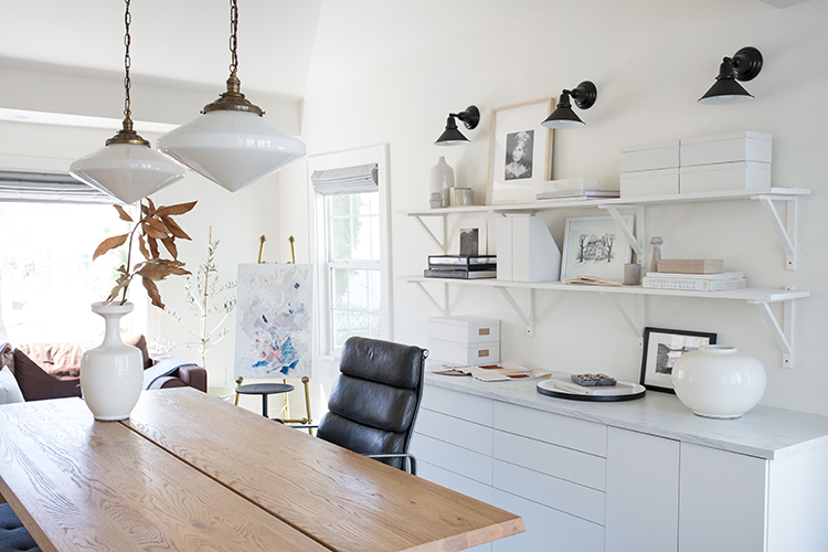
The credenza behind the table risky move that turned into a win. When the original piece to be custom built fell through, Laura used an IKEA 8′ countertop and kitchen cabinets 2 of these and 2 of these to put together a ginormous credenza that can store all of her photography equipment on one side, a printer on the other, and moodboards and props for styled shoots in the middle. It cost almost half the price of the custom piece with more functionality.
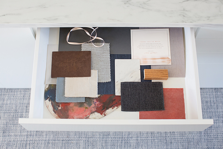
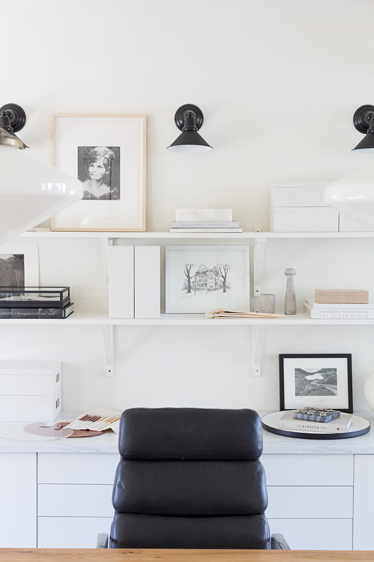
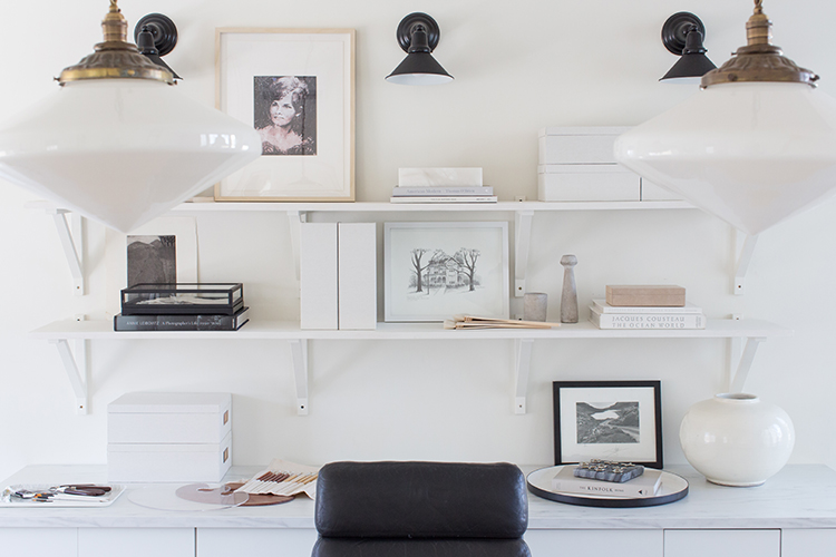
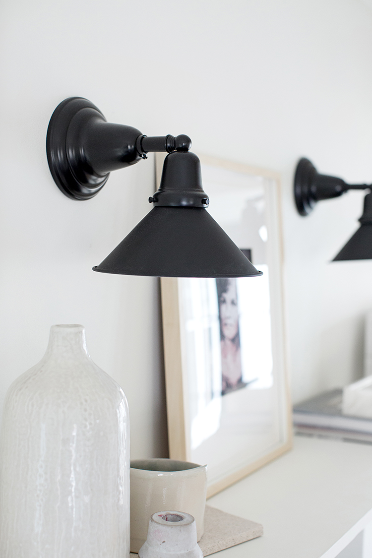
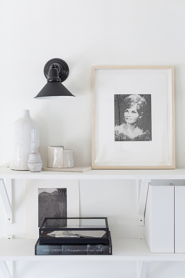
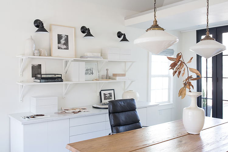
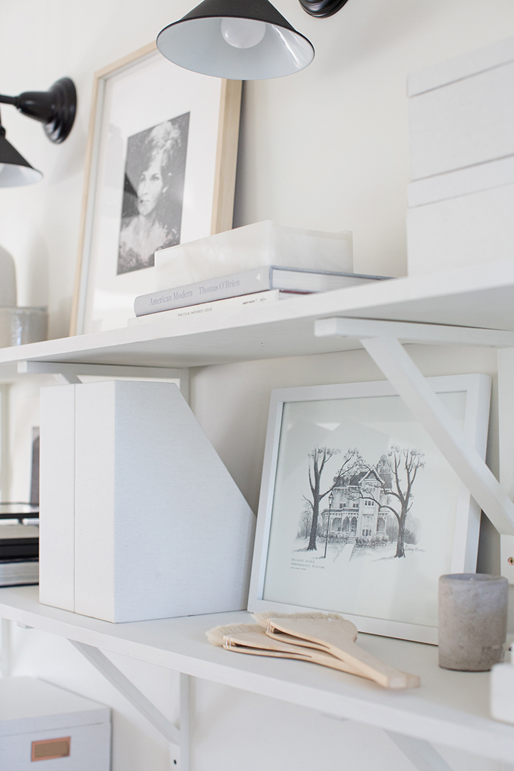
Craig’s dad made the shelves and the brackets are IKEA. The Carlton wall sconces are a great nod to the historic house and add some beautiful light at night. The Industrial Cone Shades are from the era of 1885 to 1910, and the Kackley’s house was built in 1905. Keeping with the clean feel we styled the shelves very simply. The boxes allow for more project storage without taking up any visual space. The art peppered in is all very personal, from the Harry S. Truman House that’s down the street to a portrait of Laura’s mom painted by a dear, family friend who owned an antique store and was always decorating. She passed away from MS in 2015, but her influence on Laura was monumental.
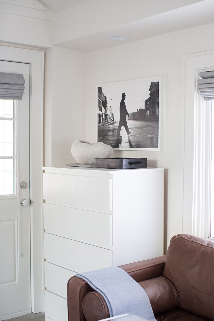
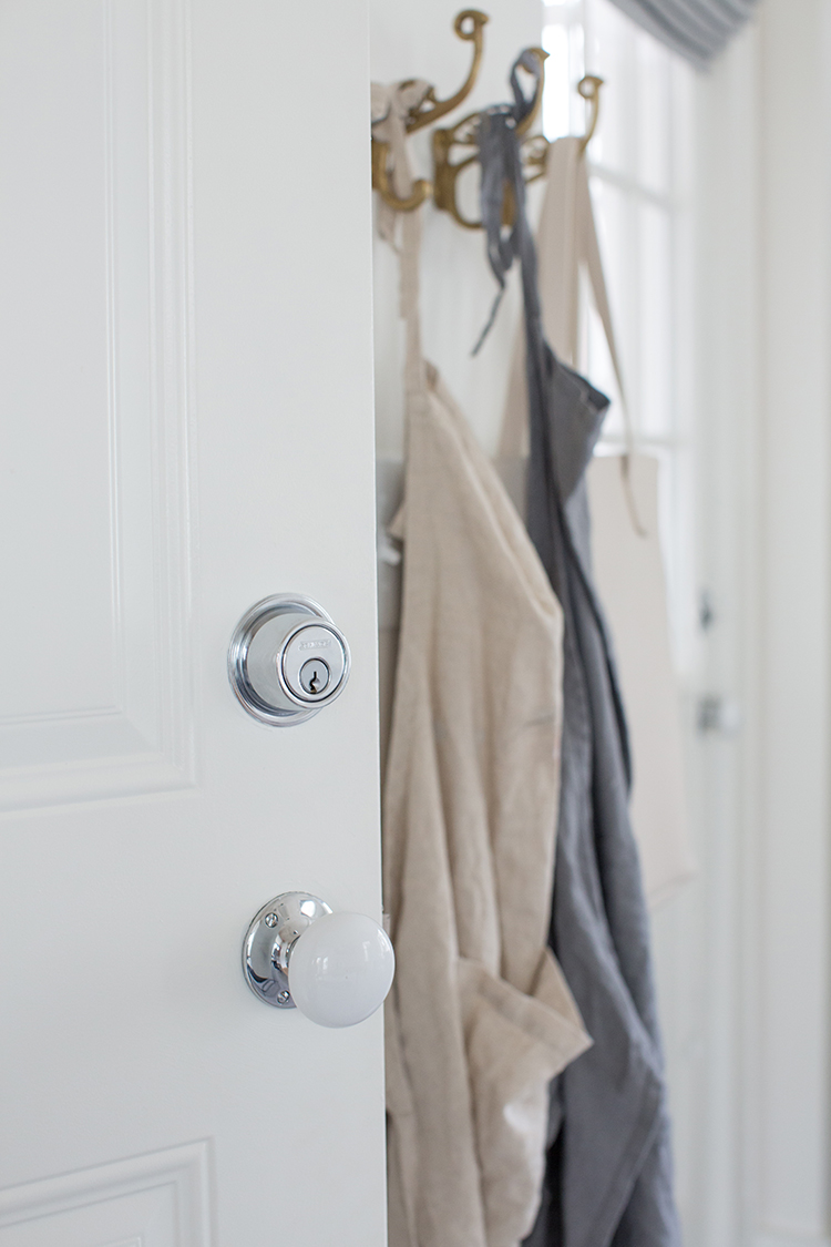
Keeping with the integrity of the home was important, so light fixtures and door hardware went classic and in finishes that match the house. 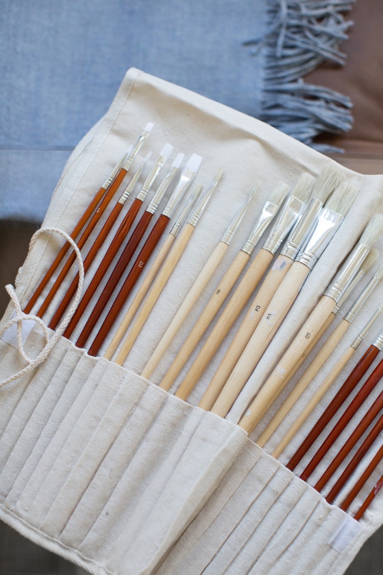
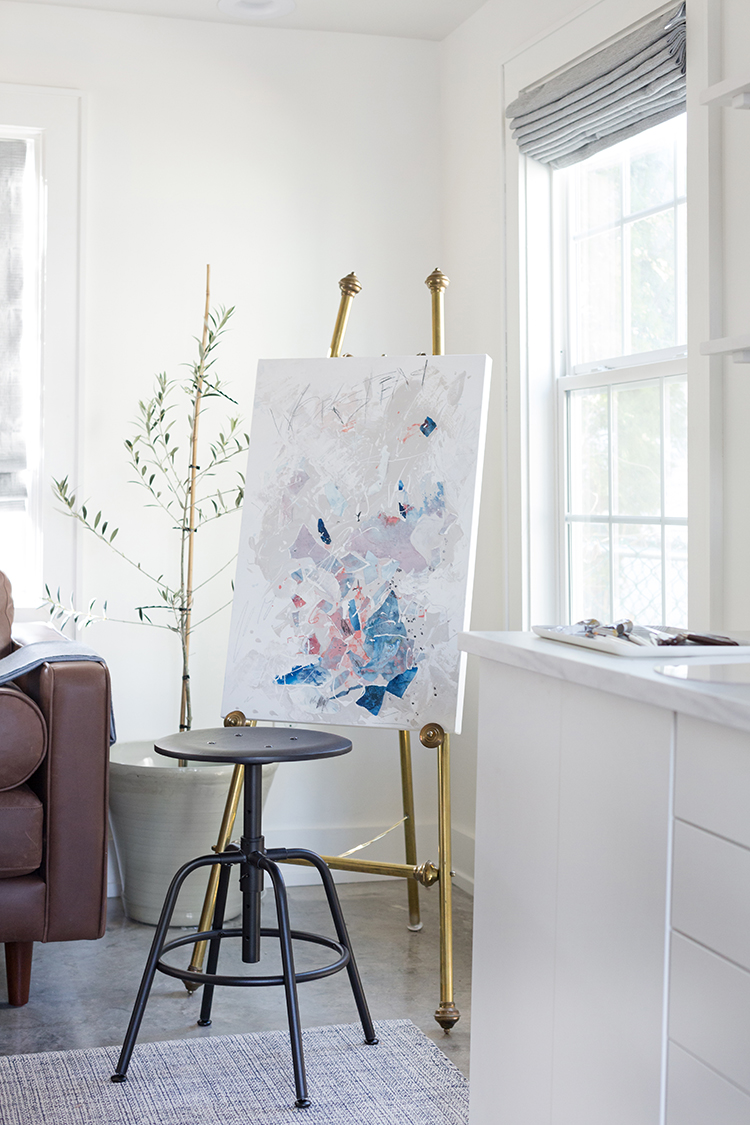
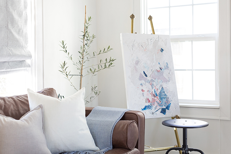
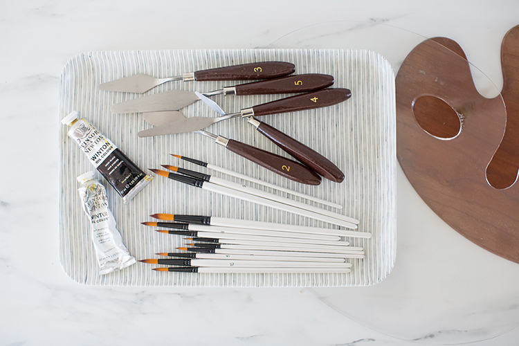
Along with editing and all things photography, Laura wanted lots of space to create. This little corner is perfect for painting on a sunny afternoon.
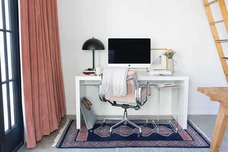
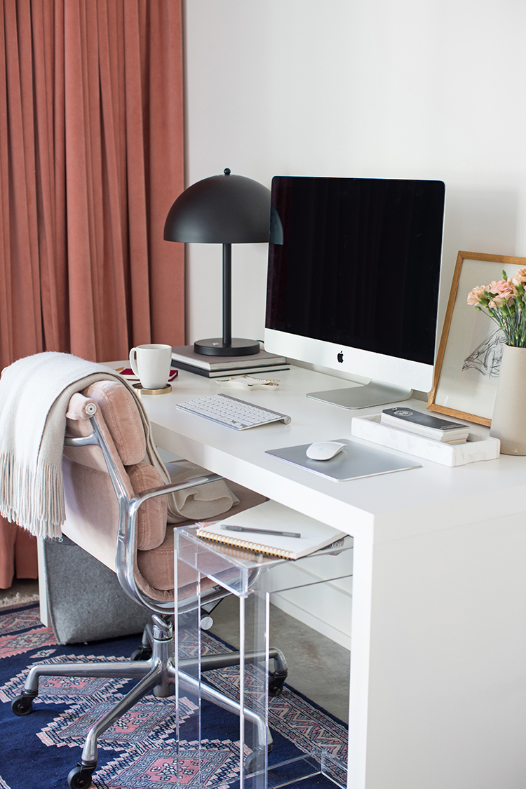
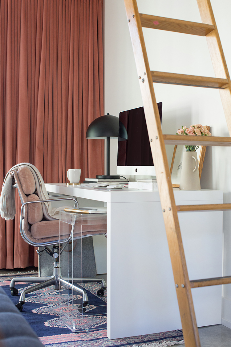
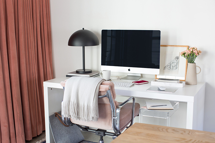
Laura’s editing desk sits in the darkest corner to make hours of screen time more pleasant. We wanted it to feel like her while still being soothing. In another scenario big art would look perfect above the desk, but Laura prefers no visual distractions when she’s making her way through a wedding. So we kept it really calm and added some punch in the drapes. Craig found both Eames chairs on Ebay several years ago, and the idea of his and hers is a great touch. We took it one step further by reupholstering Laura’s in some extra blush velvet I had left over from my tub chairs in my living room.
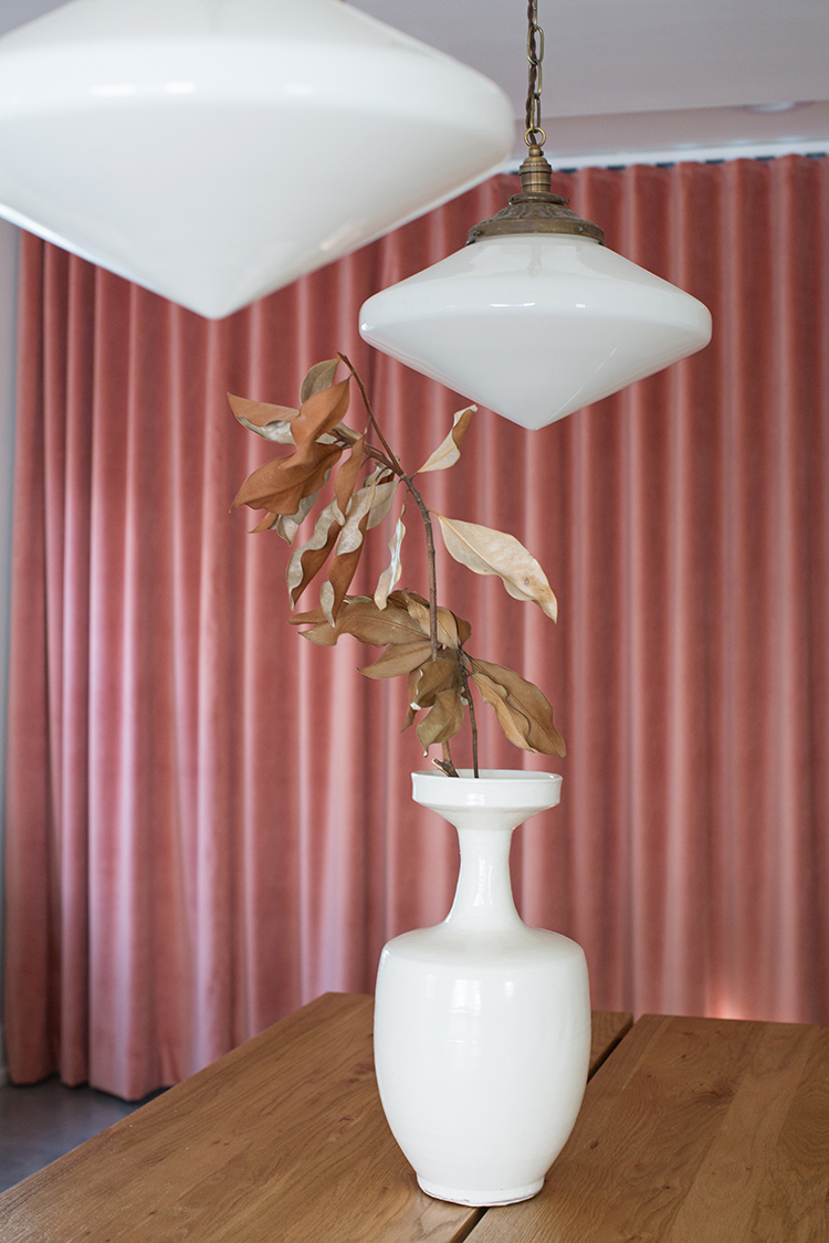
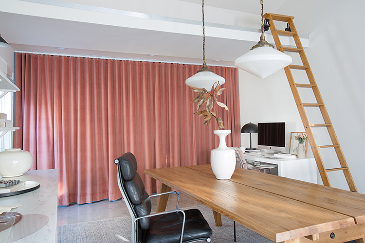
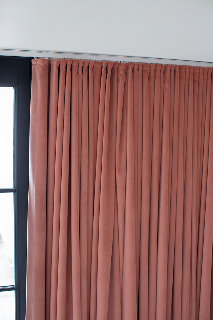
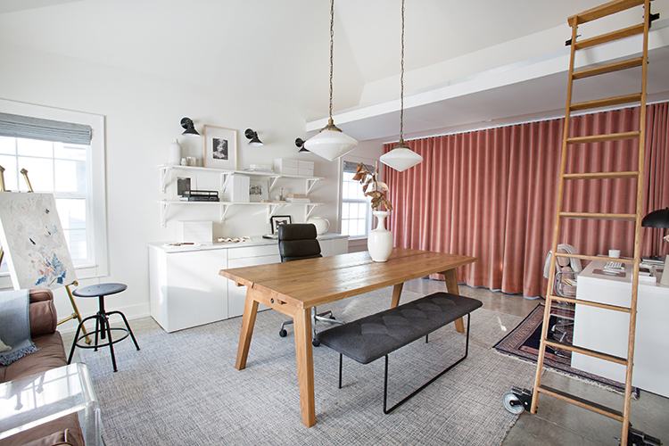
Let’s talk about those curtains. I mean, can you even? I wish you could feel these things…like butter! Apricot is kind of Laura’s signature color. Her business is branded with it, and she really loves it. Because the rest of the space was so calm, we felt like we could have a moment over here. The small eBay rug ties it all in. This was certainly the biggest splurge in the space, but one that was well worth it. The curtains are fully lined, and the fabric is Lush 26, available to the trade from Fabricut. It’s the perfect shade of apricot. We turned to Weave Gotcha Covered who did the girls’ bed curtains again because Kelly and her women do the most amazing job, and supporting them is worth every penny. Kelly is so knowledgeable and created one big panel on a track that pulls shut with a rod. It gives total privacy from the street at night. It also takes away glare for Laura when she’s editing. Plus it adds amazing warmth and interest without being too visually stimulating. Just look at those lusciousness!
What a transformation, right? That was a lot to pack into one post, so let me know if you have specific questions and I’ll get you answers! It’s hard to pick a favorite element, do you have one?
See Laura’s Living Room Reveal here.
Photos by Lark Photos.
Thank you to our wonderful partners: Annie Selke, Article, Fabricut, and Rejuvenation. All product selections and thoughts are our own.
LET’S CONNECT! FIND ME ON…


Gosh it’s so gorgeous! I’ve been searching for a acrylic Z table since we shot at her house. I’m working on a lounge feel for my piano room. Any tips where’s i can find one? I’m so happy for Craig and Laura’s beautiful space!
Hm, I see a lot of C tables like the one I linked from CB2 or at Homegoods, but haven’t seem many Z. Have you checked Wayfair?
How did you raise ceilings? And is that a huge expense? I would love to do that in my interiors but everything I find is like 18k a room!
They got really lucky and found that it was already like that above the ceiling. All they had to do was put in the ties to secure it. Sorry I can’t be more help!
How nice to have an extra space like that. I think my favorite element are the drapes. What a statement they make! I love them!
But what did they end up doing with the stuff that was stored in the former garage?
They have a shed in their backyard that fit all of the necessities and everything else was donated or sold. Thank you!
I love this space! The white/navy/pink color scheme is my favorite. What is the acrylic table tucked under her desk? The one with out wheels? It is the perfect way to add extra work space. Thanks!
It’s from Homegoods! They often have little pieces like it.
Love the new space! Especially the pop of apricot and the office chair…
Thanks, Beth!
Beautiful space. The transformation is incredible. Also, please check the link for Weave Gotcha Covered. Would love to learn more about them, but the link is off. Thank you for sharing. I look forward to all of your posts. Your work is stunning.
Just changed that, sorry Jodi, thanks for letting me know!
Great idea on the Ikea kitchen base cabinets for storage! May I ask which one you used to store the printer? I’m looking for something that will fit mine. Thanks!
The ones on the end are just big and open, so I think almost any size printer would fit!
Wow, what a transformation. It looks so good! I love the color scheme and the layout. My favorite piece is the ladder – I dream of having one in my house some day.
Thanks, Christina! We were lucky enough to get these off Craigslist a few years ago and still love them very much!
Such a great space! While I’ve got the studio at our current posting, we’re hoping that with our next move we can buy and I can have something similar to this! Looks great 🙂 I especially love the thick curtains.
That would be great! Thanks, Ariel!
Awesome! Does it have heat?
It does! That little thing over the door controls the temperature!
Holy smokes Gwen!!!! What an INCREDIBLE transformation. This gives me so so much inspiration for my own dreams nor converting our detached garage into a work studio for myself. I Loooove all the little details in this space. The curtains are gorgeous. The matching chairs are such a great touch too. Wishing them so much joy and productivity in this beautiful space!
Yes, I can’t wait to see what you do with that space!
Looks fabulous, Ladies!!!
Thanks, Mel!
I love this! Simple, modern, yet oozes style. Great job!
Thanks, Jenna! Such fun to put together!
Can I use “insane” to describe this space?! It’s insane! So beautiful, and it sounds like it works with their needs perfectly.
That’s so nice! It definitely does!
I am not a very pink person, but I must say the curtains are amazing and the pink chair is also perfect in the space. Good job!
Love hearing that!
I love the colors and the cool vibe in every piece that went into your photos! Stunning home. Thank you for sharing. I loved everything 🙂
Thanks for following along!