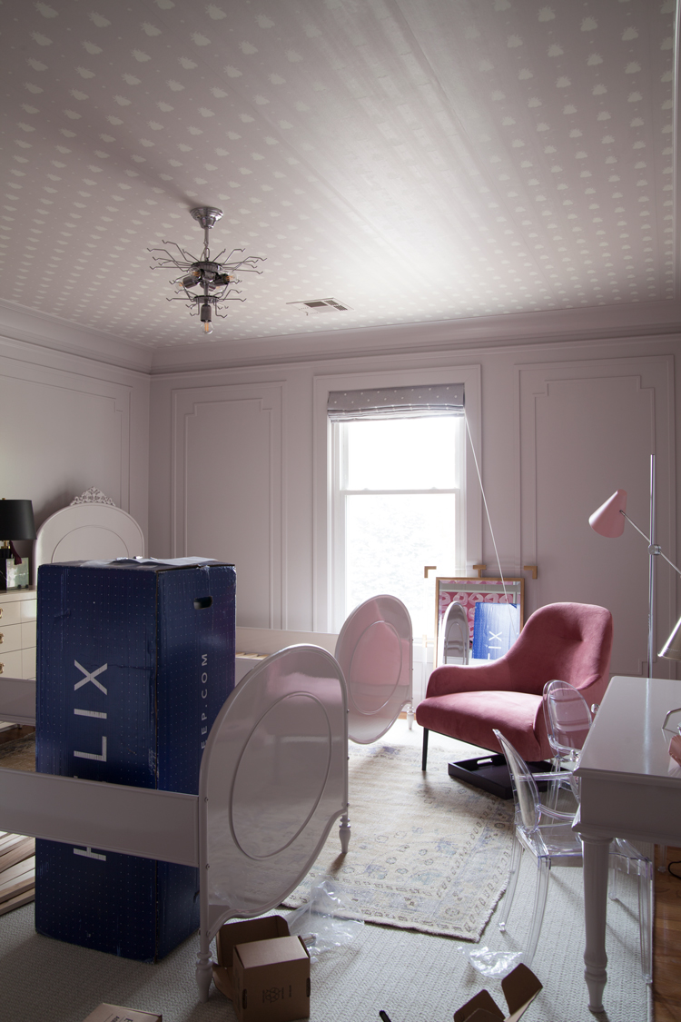
 We’re headed for the finish line and the room is really starting to take shape! Doesn’t it look like it? Ha. After our crazy week last week we all ended up sick over the last few days and that put us a bit behind schedule. I’m hoping we can play catch up today and tomorrow as bad as the rest of the house has become, laundry and housework will have to wait! I took these photos yesterday afternoon, just to show you exactly where we’re at. Lots of details left, and here’s to hoping not too many hiccups because hiccups are inevitable. In case you missed the journey up to this point you can catch up here: week one, week two, week three, week four, week five.
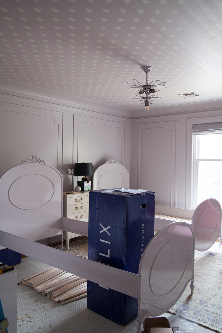
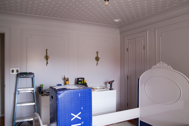
How about those glossy beds though?! I can’t believe how great they turned out. We had these beds sprayed to match the walls. I know for many, where it is now would be the stopping point, but if you’re a regular follower you should know better coming from me. Now it’s time to add the pops!
You all had some amazing questions and honestly, many of them could be stand alone blog posts, but I’m going to do my best to answer them in a paragraph or two here. If you have any further questions or want to add your thoughts to any of my answers, I would love to hear! I am not a professional designer so my answers are solely based off of experience, and I’m always looking to learn more myself so comment away!
Jennie asks: When designing a room, do you design it independently, or do you give thought to the style / scheme of the whole house? I love the idea of creating a flow throughout the house, but it also gives me pause when making design decisions because I over-analyze whether a bold choice will impact other rooms in the house.
A: This is a great question! I think you have to start by thinking about the room and how it connects to others. If the room is only accessible by one entry you can have a lot more freedom with it like a powder room. If the room isn’t a pass through or connecting space I like to design it a bit more individually and consider ways I can tie in the adjoining space for some continuity. For instance, the upper sunroom in our home has lots of burgundies and wines. It’s right off our master, so when picking a rug for the master bedroom mini makeover mini because someday we’ll scape that awful stuff off the ceilings and deal with our strange layout I selected one that was burgundy.
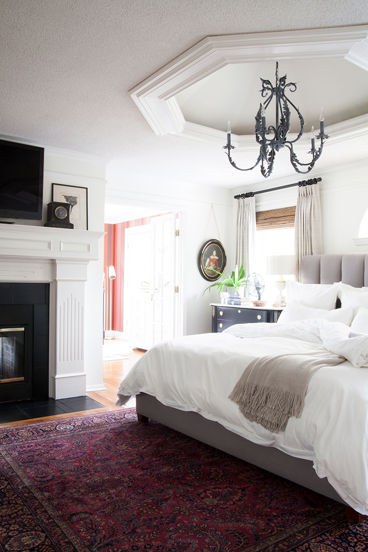
The striped paper and the rug speak to each other. Another great thing to do is pull colors from a rug or art in one room for other spaces in your home. Our main level is a traditional colonial with two front rooms, two back rooms and a center hall.
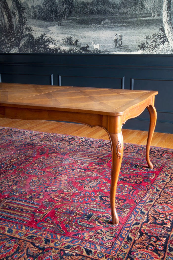
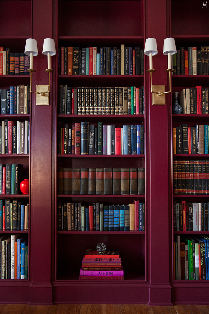
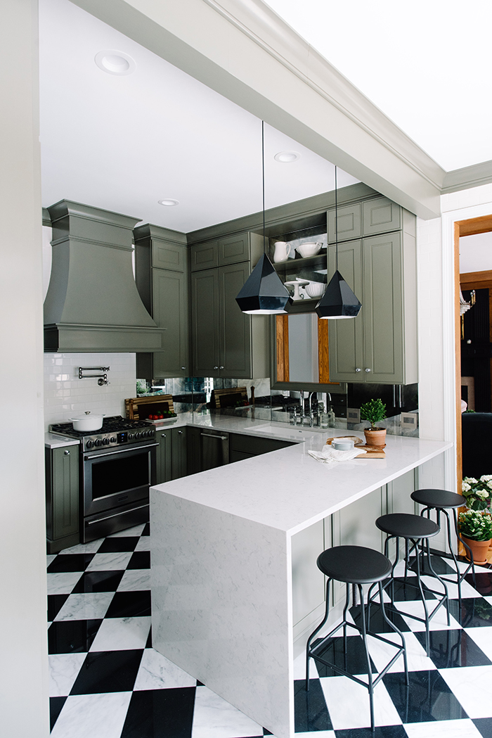 They are their own spaces, but they need to talk to each other. Our dining room rug has the best colors in it. I didn’t pull any of those colors out in the dining room, but I pulled the color for the bookshelves in our library from the rug, the kitchen cabinet color from it, etc. This creates a flow that is subtle and still allows you to have pops of color that feel intentional. And a bold choice will always impact, but that doesn’t mean you have to be scared of it!
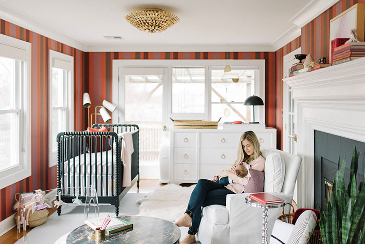
Sarah asks: How do you balance modern along with choices for kids within a traditional design. Based on your other rooms, you seem to have a knack for for the mix and I’m curious your thought process/considerations.
A: You’re speaking my design language! I usually try to keep the bones traditional – the moulding, flooring, anything more permanent – and then I bring in modern elements through furnishings and accessories. For Milly’s room I wanted to ensure that almost everything could grow up with the girls. Some of the art and decor elements will be more juvenile, but those are things that can be easily swapped out as they grow. I always err on the side of classic and traditional when in doubt.
Tiffany asks: How do you determine which molding you should use in a room? Do you have a go-to-style that you use in most rooms or is it different most times? Thank you for sharing the exact molding for this room! We want to add molding to the rest of our rooms and don’t know what will look good and what each will do to the room.
A: I think it’s important to consider the adjoined rooms, and I personally have kept any moulding we’ve added the same on each level of our home. It was pretty common 100 years ago to have more detailed, fancy millwork on the main level and then have more simple trim upstairs. We have done just that in our home. If you’re not sure what to use I suggest going to your local lumbar yard or big box hardware store to get some samples you can usually get a foot of anything you’d like and bring it home to try it out. Don’t forget you can always layer pieces for a chunkier, more detailed look. It will mean more caulking and nail holes to fill, but will save you money. Keeping the crown, base, and casings the same in a home is great, but if you want to switch it up I would keep the levels the same. As far as wall treatments go and adding extra to the foundational pieces of a room, have fun!
Shelley asks: How do you go about picking color schemes and deciding what colors work together and what colors don’t?
A: Color schemes are one of my favorite parts of planning a room. I typically start on my Pinterest boards you can follow me here or screenshots I’ve taken on my phone if I don’t already have a jumping off point and go from there. I am usually more inspired by fashion and art than other interiors. It could be a 17th century oil painting or a blogger’s latest outfit…I love to pull color schemes from everywhere. For this room I was really inspired by surrealist art and the idea of layering lots of similar tones on top of each other. I always like to add a pop of something unexpected, and the art will also bring in some different colors as well.
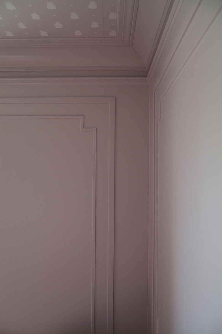 Julie asks: What are your thoughts on painting crown moulding in a room? Is white now dating a room?
A: I love a room that has colored trim. It’s definitely something that feels fresh, but if you look back it’s a very classic treatment. I like that it makes for a clean wall and allows the art and furniture to really shine. I think you have to leave this to personal taste, but I love when trim and crown are a color. It also elongates your walls. Your main level is 10′ but our upstairs is only 8′. If it’s all the same color it’s going to feel taller.
Several of you asked: Can you give some tips for mapping out moulding in a room? How you determine spacing of each box, especially from one wall to another…?
A: This is a great one and still tricky for me, but I’ll tell you some things I have learned and my personal preferences. I am a symmetry girl, so first I will say that I will always choose symmetry. My goal is that every box on a wall is the same size and that all of the boxes around the room are about the same size. The odds of you getting exact are slim, but within 6-12″ is nice. I prefer a wall to have an odd number of boxes, but sometimes that doesn’t work. In Milly’s room I only got one wall that has three boxes and the other walls all have two. But those walls have a window or a door on them, so they still have an odd number of things. If you have tall ceilings and shorter doors I always put a box above the doors. If you’re doing a box inside of a box, like we did for Milly’s room, it’s not a bad idea to put a nice amount of space in between the outer boxes. That way they don’t all run together visually when you look at the sides of the boxes. We left 8″ on either side and in between our boxes for this room.
Kelsey asks: You seem to do this in real time, which is amazing. Do some designers start earlier? I’d love to hear how it works with the sponsors and what percentage of sponsors you use every time.
A: I can’t speak for the other designers, but we have pretty much done all of these in real time. The sunroom was an exception because we revealed a few days after Domino’s due date, and I didn’t want to chance going into labor a lot earlier, so we got as much of the room done as soon as possible on the front end, and I just broke that up into some of the later blog posts. But I do recall the day we got home from the hospital Micah trying to install the sink, faucet, and window treatments and A LOT of tension that day. Ha. Regardless of when you do it it’s quick and stressful, but the payoff of having a room totally done at the end is awesome.
I will say that the planning begins at least a month ahead of time, and that’s where I honestly do most of my work. I am an obsessive planner, and it takes me a very long time and lots of thought to put together a room. Linda, the challenge’s creator, usually reaches out to us a month or two ahead of time and things like furniture orders and some of the higher end pieces have to happen in advance of the six weeks for shipping purposes. Linda works so hard to get incredible sponsorships. While you’re not obligated to use any of them, I try to incorporate as many as possible into my rooms. Other than the great exposure of the challenge, the sponsorships are what make it so amazing! There are things we definitely have to pay out of pocket for, but the partnerships allow me to really go big and design the space of my dreams!
See you next week with the reveal! And be sure to check in with the other designers this week…
Boxwood Avenue | Coco & Jack | Design Manifest | IBB for DWD | The House That Lars Built | Little Green Notebook | The Makerista | Making it Lovely | Old Brand New | Old Home Love | The Painted House | Megan Pflug Designs | Pink Pagoda | Erica Reitman | Sacramento Street | Simply Grove | Jill Sorensen | Sugar & Cloth | Vintage Rug Shop | Waiting on Martha *
Media Partner House Beautiful | TM by ORC

You kitchen cab color is amazing! Going to have to stalk that now. Love the way the room is coming together and LOVE the beds – they are amazing!
Thank you! The beds are really good, especially now that they’re painted!
Oh my goodness! Those beds look incredible!
Thank you, Jordana!
I’ve loved watching this space come together! It’s looking so good!
Thanks, Alyssa, we’re getting there!
This room feels so Parisian. So soothing and chic. Can’t wait to see the details!
Thank you, that’s a big compliment! 😉
This is just so beautiful! I wish I had your talent, I really do!! On a practical note, looking through these pictures and others, it looks like your bedroom and Xander’s bedroom have similar curtains. Can you share the source and style of them? Or either anyway. Thanks!
Thank you! I made the curtains in Xander’s room, but you can read more about our bedroom curtains here: http://www.themakerista.com/master-bedroom-white-walls/
it almost seems like your house’s color palette is that rug in your dining room — at least for the main floor. do you have a color palette for your upper level? i really think that’s something i need to do better in our house!
The main floor definitely is! I think the burgundy is pretty much in every room except Xanders and the playroom at this point, so that seems to be a continuous theme…it really does bring a flow!
I love the huge crown moulding! Question – How tall are your ceilings??
Only 8′, Caroline!
Quick question – where did you get the ceiling light?
Thanks so much for taking the time to answer all our questions!
Of course, thanks for following along!
I have adored following you through this entire process! And the result is absolutely gorgeous!
Thank you so much, Libbie!