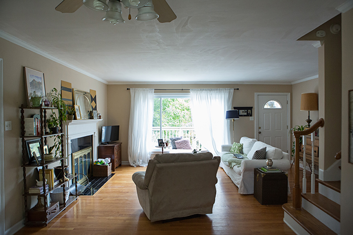
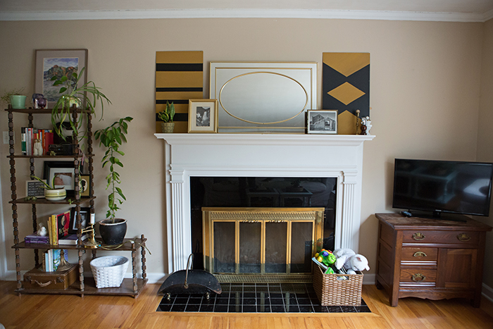
Today I want to give you some of the details and sources for the makeover. This room is technically two spaces, and I feel like we did a lot in those spaces, so I’m going to break things up and share the living room with you today and the dining space another day. With the timeframe and the budget (plus Chelsea’s love of secondhand items) we wanted to use as many of their existing things as we could. They had some great pieces, most just needed a quick update. Here’s a reminder of the before…
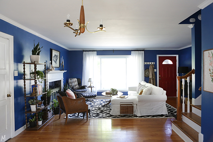
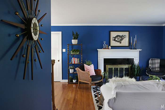
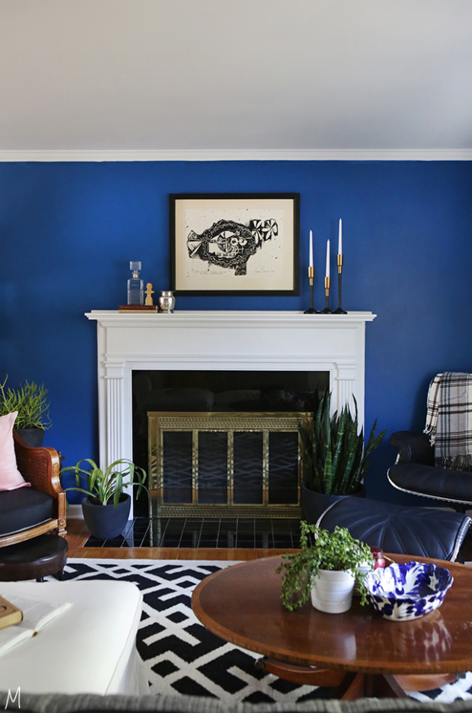
and the space now…
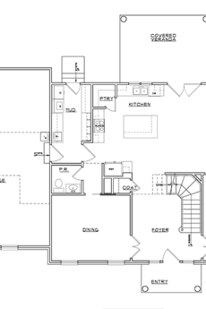
As you can see, the layout did not change drastically. Chelsea has a good sense of what should go where, but with a few tweaks we were able to create better flow and more good use of space. The most dramatic and cost effective change was definitely the paint. The walls went HGTV Home by Sherwin Williams Jay Blue and the Door went Show Stopper. Also note how raising the curtain rod up as high as possible instantly adds height to the ceiling.
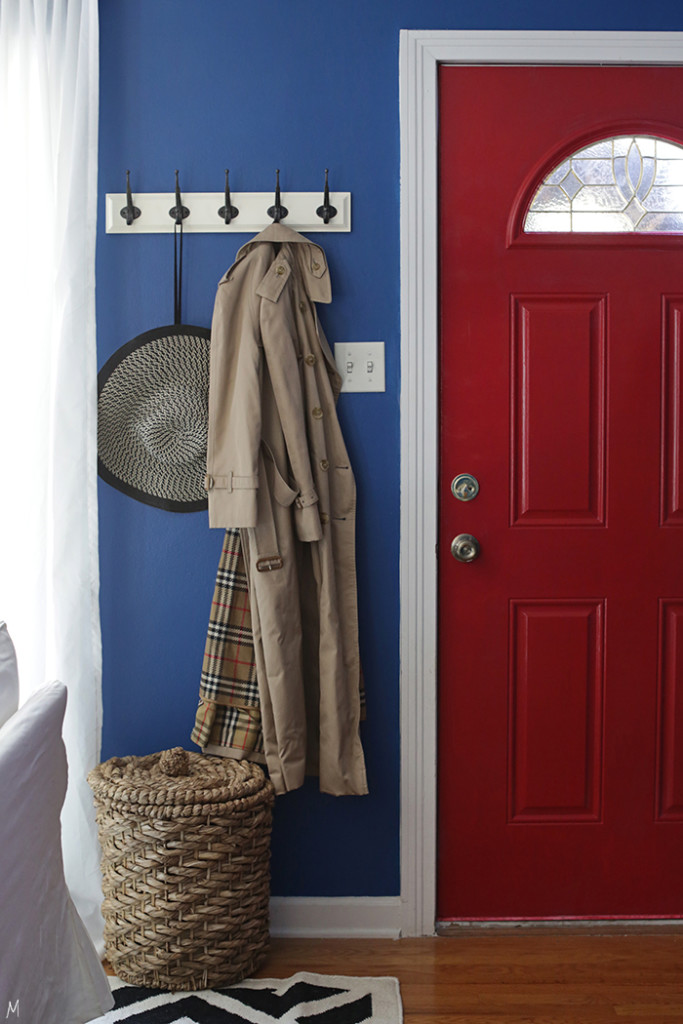
Any home can have an entryway, whether there’s a designated space or not. By scooting the couch up a few feet we were able to give the Craigs a pretty place to drop their things at the end of the day. Coat hooks for jackets and hats and a basket for shoes keeps things neat and orderly, yet accessible. Chelsea snagged that Burberry trench at a thrift store for almost nothing!
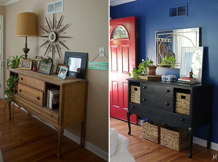
This buffet was passed down to Chelsea from her grandmother. The piece had some damage, but we were able to fill holes and give it a fresh life with some paint and new knobs. Now there are baskets
for mittens and scarves with toy storage below.
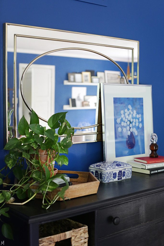
And trays and boxes for keys and mail corralling.
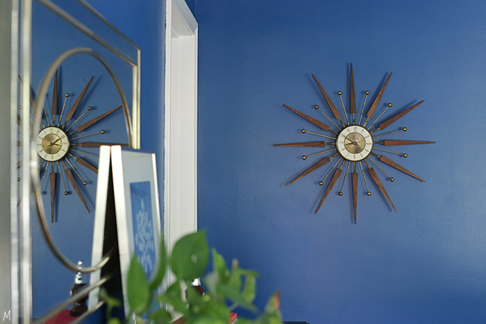
I moved the mirror from the mantle to above the buffet for quick checks on the way out the door and shifted Chelsea’s incredible mid-century clock to the wall you see when you first enter the home. It stands alone so beautifully against the blue.
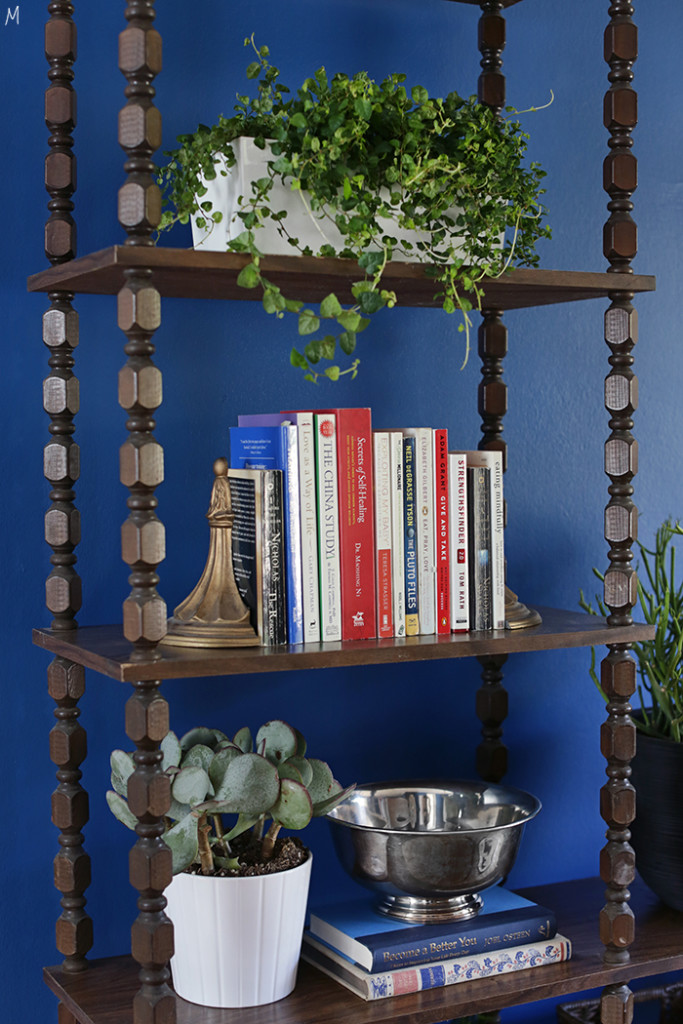
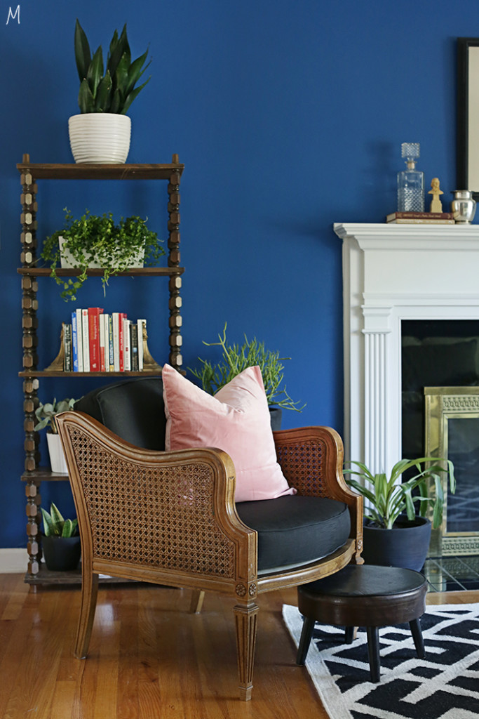
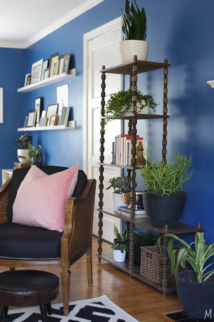
Chelsea wasn’t sure about the fireplace when we first talked, and that beige paint wasn’t doing it any favors. I knew the right color would make the woodwork and brass shine, and the original artwork she already had brought that mix of modern against the traditional mantle and firebox. The shelf was something Zac hoped to see go, but with the right styling it was perfect for the space.
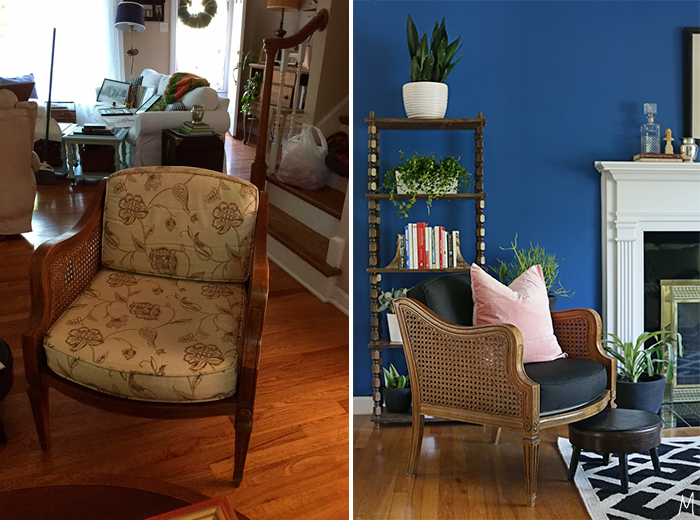
Chelsea and Zac had several chairs they loved to read in, and when comfort is already there, why mess with a good thing? I just had them reupholstered: this seat was actually redone with a window curtain, which was surprisingly cheaper than buying regular home decor fabric and is really durable.
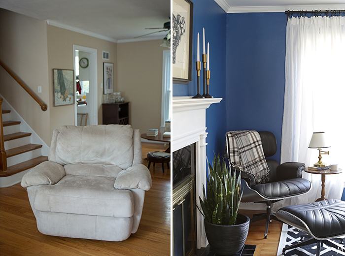
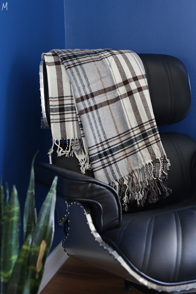
I told you in the last post about the recliner they had purchased secondhand for Zac to sleep in during his recovery. Replacing that chair was my number one priority in this whole refresh, and I wanted whatever took its place to be a showstopper. I came across this recliner on ATG and it hit all the buttons: sleek, cool, a little glam, but totally masculine. It was definitely a splurge but Lowe’s saw the importance in it, and I think both Zac and Chelsea were so excited about this piece. I love that we created a little nook for Zac to read in – a corner to call his own.
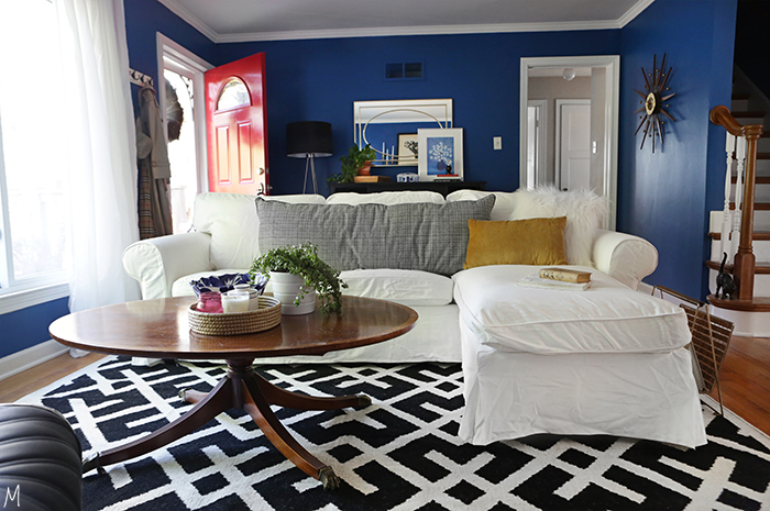
We kept the classic, slipcovered sofa the Craigs already had, but it really pops now against the blue walls and that bold, statement rug. The coffee table that was formally on the other side of the room fits perfectly in the nook of the sectional and brings in some more natural wood to the other graphic elements in the space.
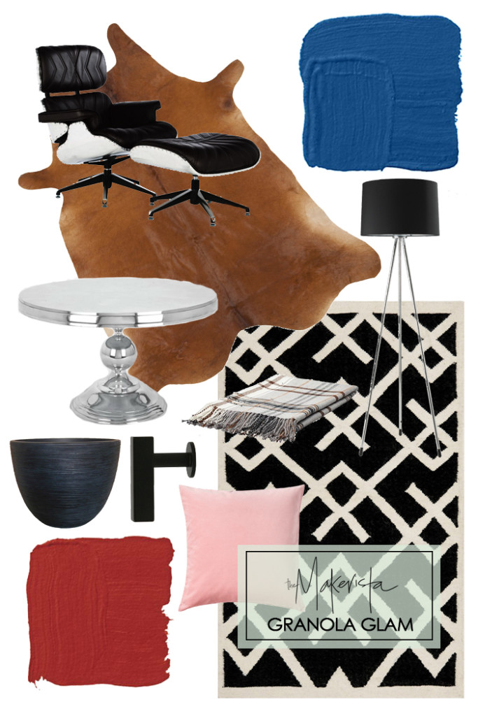


I feel like I'm missing something – where is the cowhide in the picture? Ha ha I've been scouring the photos but can't find them. While this is definitely outside of my style comfort zone, it looks incredible!
Ah, ha! The cowhide is on the other side of the room and I made the shoppable image before I decided to break up the post into two. 😉 Sorry about that, the pictures with the cowhide are coming though!
What did you do with the TV? It had such a prominent place before. 🙂
It's not gone, you'll see it when I share more about the other side of the room, but they really never watch it. I was pretty impressed with their desire to read and play games over screen time!
You totally rocked this room! The wall color is perfect, and I am glad you were able to reuse the shelf they already had, it is pretty cool.
Thanks so much! Yes, I thought it was really neat too!
Looks great! How did you make the couch look like a sectional in the "after" photo? Is an ottoman just sitting near the couch creating that effect? Thanks!
Ah, good question. So, it's an ikea couch that comes with a little ottoman. There are 2 different types of slipcovers, one that has it as an ottoman and another that makes it into a sectional chaise. While they kept the same sofa it was time for a new slipcover so we got the white but the one that was the chaise. Hope that helps!
So glad you kept the shelf- it's one of my favorite pieces!